


Quiet Transgressions
Wherein I wax lyrical about some funny yet transgressive comics

I wasn't a huge reader of Mad when I was a kid, but my friend lent me his dad's copy of an old pocketbook, A Mad Look at the Movies. I did, however, like British humour comics, particularly the strips featuring the work of Ken Reid and Leo Baxendale. It wasn't just the quality of their craft, it was the weirdly transgressive nature of their work. I still remember crying with laughter while first reading Dash Decent, Kevin O’Neill and Dave Angus, and Dourdevil, by Alan Moore and Mike Collins. Above all, I loved D.R. & Quinch, by Alan Moore and Alan Davis, which was genuinely hilarious.
Underpinning all of these works is a degree of surrealism and a dark, anti-establishment edge. These were transgressive comics hiding in plain sight, dressed as humour strips. In Britain there's a long-standing tradition of incorporating a transgressive undertone within kids comics, with Dennis the Menace and Minnie the Minx and this was extrapolated to adult comics most notably with Viz.
Here are a few comics that I would recommend that fall within this broad field. I’d add the caveat that these aren't necessarily overtly or loudly transgressive comics, but there's off-kilter undercurrent that somehow challenge dominant norms and values.
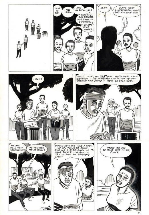
Like a Velvet Glove Cast in Iron
I cannot express how much I enjoy this comic, originally serialised in Daniel Clowes’ Eightball. It’s absolutely deranged and reads like an acid flashback expressed through a stream of consciousness, or dream logic manifested through beat cartooning. This is possibly my favourite of Clowes’ work although he has produced arguably better comics. It’s a surrealist nightmare and if feels pretty Lynchian, but not in a contrived way. Apparently the title comes from a quote from Faster, Pussycat! Kill! Kill!1 Clay Loudermilk is one of comics’ unsung protagonists, motivated by a morbid lust for the star of a BDSM film he sees in a manky porn theatre. I read this comic a couple of times a year and it never fails to make me laugh. I have The Complete Eightball, which I would argue is essential reading for any fan of the medium.
Clowes’ art style seems much less relaxed here, it feels like he’s pushing himself, which he has spoken about in interviews, ‘When I was younger, it was such a struggle to get what I was trying to achieve, I would work and work and work to just get one page right, but then you’ve got to do the next page. I had to do that with Velvet Glove, I had to keep that style going for 150 pages, and that got really tiresome. And I was constantly just going, “That looks horrible!” and feeling terrible about it. In the last 10 years, I like the way the drawing looks, and it feels sort of effortless’.2
Here’s an excellent conversation between Noah Van Sciver and Daniel Clowes, which I recommend watching.
El Borbah
This isn’t Charles Burns’ strongest work, but there’s something about the sheer insanity of the character and the world he inhabits that grabs me. El Borbah is a stereotypical gumshoe that could have walked right out of a Mickey Spillane pulp novel - except that he’s a 400 pound lucha libre. I have a 1998 collection of the Hard Boiled Defective Stories, originally published in Raw in 1983. I see a lot of EC influence in Burns’ work and the spotting of blacks makes me think of Johnny Craig in particular.
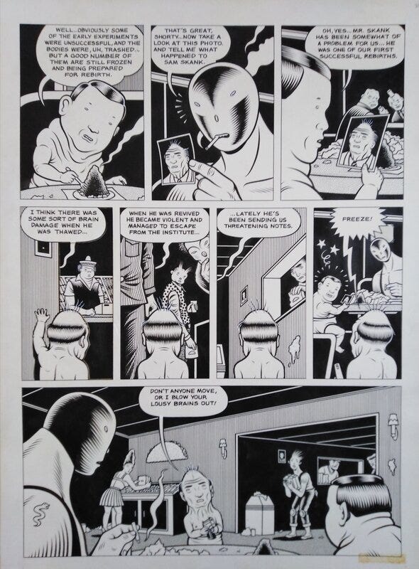
His bio on Lambiek notes further influences of Will Elder, Al Feldstein, George Evans and Reed Crandall, as well as underground comix produced by Robert Crumb and Kim Deitch. The demented, strong visuals also make me think instantly of Chester Gould and it’s unsurprising that Burns was a big fan of the Dick Tracy creator, ‘I’ve always loved Chester Gould. I love what he does; it’s real nice. Deep, dark stuff’3. As with previous cartoonists I’ve mentioned, the best read widely and learn from others, ‘I like Loustal’s work, Joost Swarte, Ever Meulen … if you get further south, I like Jose Munoz; he’s tremendous. His work, along with Sampayo’s, the guy who writes for him, is great. My Italian friends, who I’ve mentioned before … I like Tardi. There’s an endless list of people that I like…’
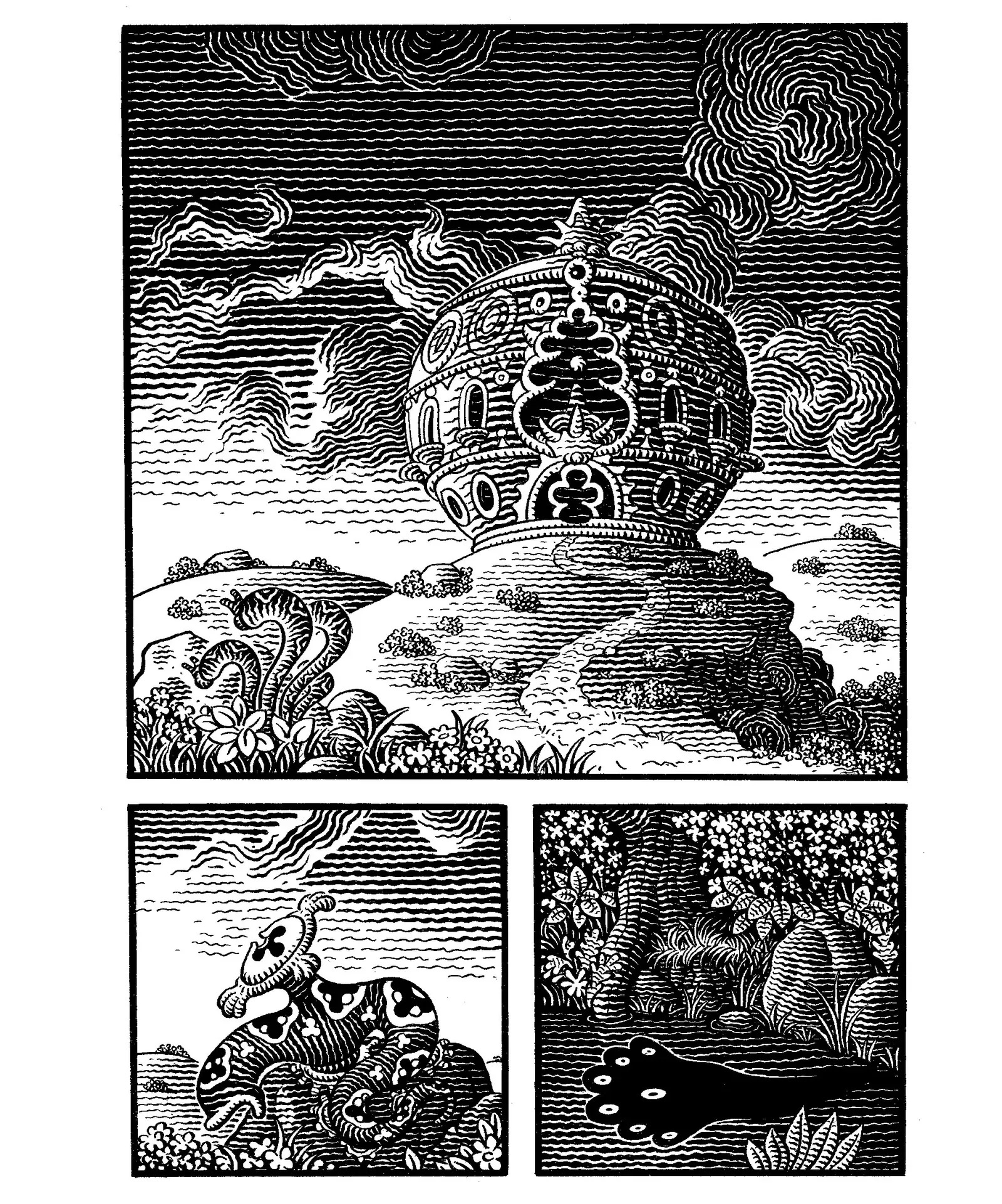
Frank
Really, I could pick any comic from Jim Woodring’s wonderfully surreal, sweet and sinister Frank series. I’ve previously that my own creative process is a mashup of Chaykin and Woodring's approaches, particularly with regards to writing. (There a bit of Paul Levitz’s structure approach4 in the way I construct stories too, with an A, B and C plot, which isn't too far from Larry David’s method on Seinfeld.) Woodring is a cartoonist, like Ditko, where I start off studying his work and then end up reading it because I enjoy it so much.
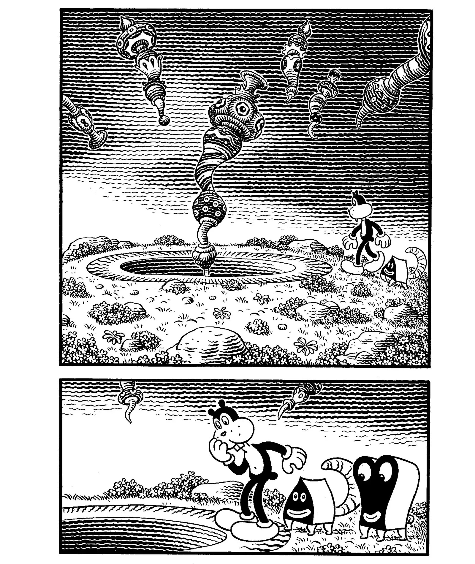
The only way I can describe Frank is that it feels like a silent, surrealist, animated film. Due to its immersion in surrealism there's a timeless quality to the work which allows for a whole submersion in the stories. With the biblical (particularly Old Testament) undertones and the woodcut feel of the art and the grotesque, almost medieval feel of Man Hog and Whim, it feels at times that Frank exists in the Garden of Eden. What’s truly incredible is that Woodring can create pathos, humour and terror within one page. Perhaps most impressively, Woodring is autodidactic, as he says, ‘They are all drawn with a dip pen and India ink on Bristol. Working out the tones simply takes planning and the willingness to do it over if necessary. The book I'm working on now required redrawing six pages of a previous story line by line. It was excruciating work, but I had to do it to make a philosophical point. And no, I didn't study etching or engraving , I didn't go to art school at all’5.
Santos Sisters
My only exposure to Archie comics while I was growing up was seeing some wee images of covers reprinted in Denis Gifford’s The International Book of Comics. I was probably more drawn to the Red Circle line of heroes that the company produced, including The Fly, Fox, Black Hood and The Shield, which were reprinted in Alan Klass’ Astounding Stories and Creep Worlds comics. However, I always enjoyed seeing Dan DeCarlo’s art, which in my ignorance struck me as a cartoonier version of Curt Swan and Murphy Anderson.
I picked up Santos Sisters: Volume 1 recently, initially because of the subversion of that Archie house-style. The writing blends in a Love and Rockets vibe, but dials up the absurdity. It's a stunningly packaged hardback, with the best dust-jacket I’ve ever seen. Fantagraphics have done a great job, which shows faith in a breakout comic. The stories and art have a mischievous core and it's one of the funniest comics I've read in a long time. This is phenomenal work by Greg and Fake Petre. I think of this as almost a companion piece to Jay Stephens’ wonderful Dwellings, a horror comic drawn in the style of a classic Harvey Comics feature like Casper the Friendly Ghost.
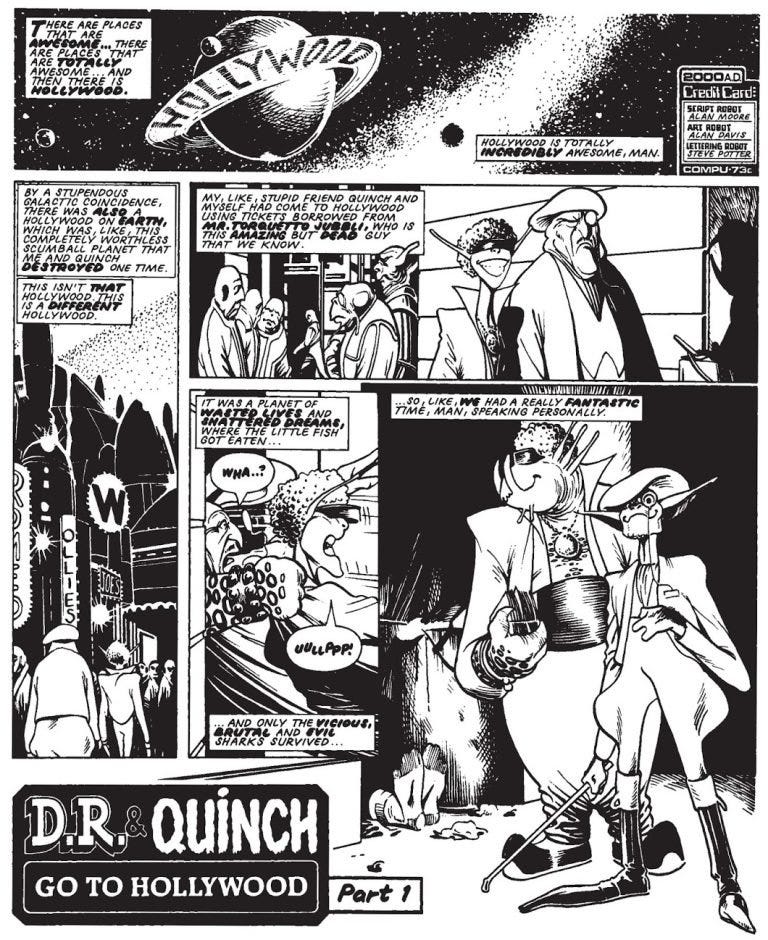
D.R. & Quinch
Alan Moore, when the mood takes him, is the funniest comics writer I've ever read. Alan Davis is an incredible cartoonist with a beautiful style that can shift to big foot cartooning seamlessly. He noted in Modern Masters Vol. 1: Alan Davis that Leo Baxendale was an influence on him artistically and it really shows here.
D.R. & Quinch carried on the tradition of British humour comics, evolving the specifically British and surprisingly dark and absurdist violent undertone alongside a spin on National Lampoons, and first appeared in 2000AD in 1983. D.R. & Quinch Go to Hollywood might just be the funniest thing I've ever read in any medium and the Marlon Brando caricature still brings tears of laughter to my eyes. It's genuinely a masterpiece of transgressive humour comics.
The Bojeffries Saga, which debuted in Warrior the same year, is another Moore-written comics that's incredibly funny, with Steve Parkhouse doing a brilliant job on art.
A Hidden Gem (#2 in a Series)
I was 7 years old when I first read The Brave and the Bold 177 (1981) and it just blew me away. It sits alongside Marvel Team-Up 83 and Batman 336 as key comics from my youth6.
The lead feature is a great murder mystery written by Mike W. Barr, coloured by Adrienne Roy and drawn/lettered by Jim Aparo. In the story Batman teams up with Elongated Man and there's a great dynamic between the characters. On this kind of form Aparo is the definitive Batman artist for me. It's easy to see the Neal Adams influence, with Frank Robbins, Alex Raymond and Milton Caniff in there too. (And I think Aparo is a visual influence on not just Alan Davis, but John Byrne too). Aparo himself said, ‘ I went to Hartford Art School for a semester, just to brush up on anatomy. I'm self-taught. I just drew as a kid and went with it. I studied and copied comic strips and comic books. I grew up with Superman, Batman, and Captain Marvel. I really liked Captain Marvel Jr. by Mac Raboy. That was beautiful stuff. I liked Alex Raymond, Milton Caniff... all of those guys’.
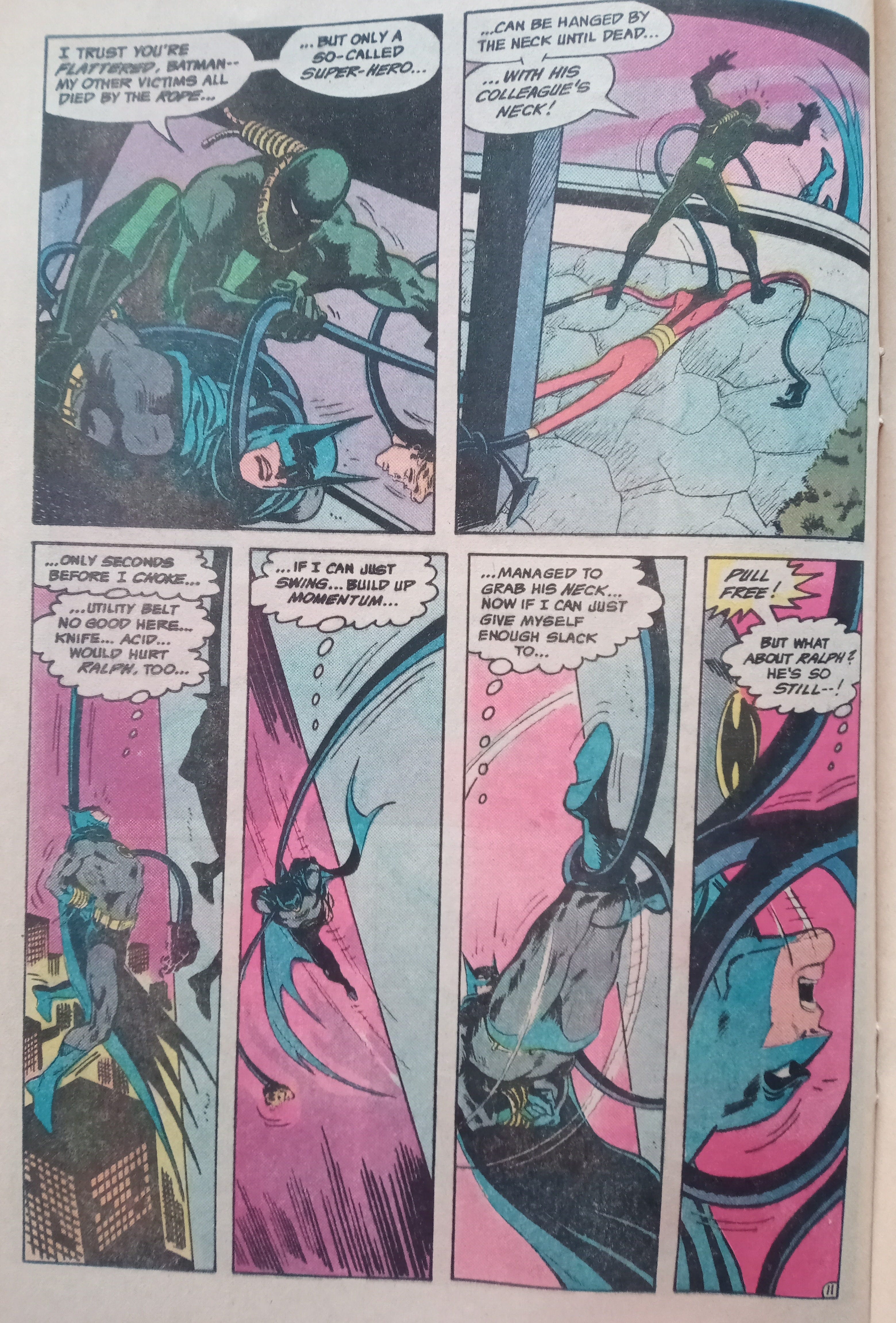
Here, Aparo's figurework is as good as John Buscema's and his storytelling is sublime. At times Aparo struggled with female faces, but everything is beautifully finished. His page design is great and his panel composition is phenomenal. His inking is sharp, rooted in the chiaroscuro of Caniff and his use of up-lighting is particularly eye catching. Depicting motion is one of Aparo's great strengths and that's something I tried to take from him in my own drawing. For example, a close-up of cropped legs or feet in the foreground moving towards the reader suggest that figure is exiting the scene. Showing the rear of the figure with the same composition suggests that they are entering the scene. This technique implies movement, but can add mystery too7.
Sometimes Aparo's work feels rushed, but here it's gorgeous. Adrienne Roy’s colours work incredibly well with Aparo's chiaroscuro, with great lighting effects. The combination makes Gotham feel like a teeming city on the streets below the pair of detectives.
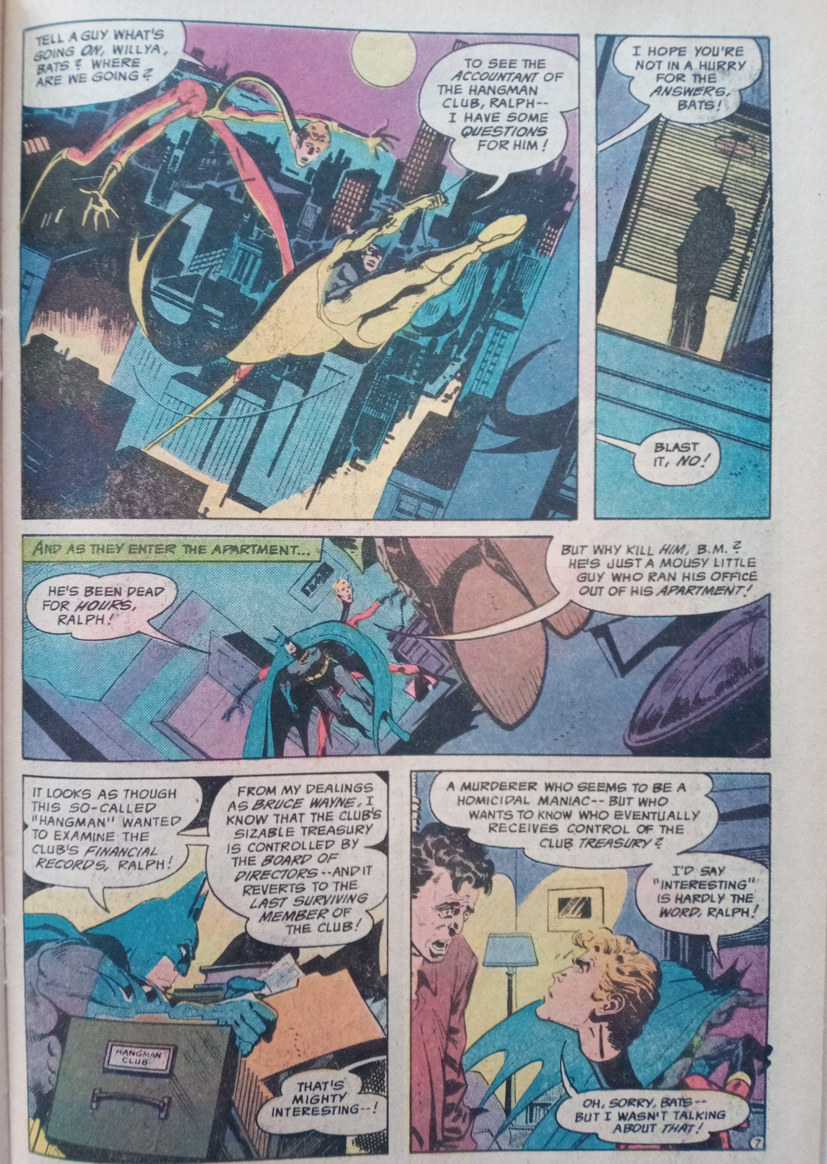
I’d wondered if my fond memories of the comic were rooted in nostalgia, but this isn't the case. It's a superbly crafted comic. It engaged me as a 7 year old child and as a 51 year old student of comics. Notably, it features Batman as a driven, but likeable, athletic, master-detective - and his relationship with Elongated Man is really well-written. Modern writers seem to struggle with this version, likely a misunderstood legacy of Frank Miller's work on Batman: The Dark Knight).
The Nemesis back-up feature by Cary Burkett, Dan Spiegle, Philip Felix and Carl Gifford is great too. Spiegle's style is somewhat akin to Alex Toth or (pre-Rio) Doug Wildey and I'm a big fan of his work. Occasionally I think his thick holding line is a bit much, but that's possibly just because the printing of the comics is pretty poor. Nemesis is a great yarn, with espionage overtones, and feels like a 70s take on an RKO serial. I really dig the strip, although Nemesis' gimmick is pretty similar to the Human Target.
I cannot recommend this comic highly enough.
Bibliographic Additions
Last time out I completely forgot a couple of other comics I worked on. I co-wrote (with my then 7 year old daughter) and drew Adventures of Woodlore in the anthology comic DUI 2 and drew a page in Lang Walk Hame, written by Peter Watson.
Last!
I am a cartoonist and you can find my work here.
According to Wikipedia. They’re never wrong.
See: https://drawnandquarterly.com/press/willamette-weekly-interviews-daniel-clowes/
From a TCJ interview that can be found here: https://www.tcj.com/the-charles-burns-interview-by-darcy-sullivan/2/
See Denny O’Neill’s The DC Guide to Writing Comics for more detail.
See: https://www.rawckus.com/jim-woodring-talks-about-frank/
MTU 83 was the first US comic I’d seen, a couple of years earlier when I was just 5. I’d been reading British comics for a couple of years before that as I was a very early reader. Seeing a full colour comic was pretty amazing.
John Buscema looked at photos of speed skaters to get a sense of exaggerated motion in his running superheroic figures.
This is great. I also re read Velvet Glove regularly. It is absolutely singular.