
Open Panels
Wherein I take away the panel borders, praise Howard Chaykin again, critique Will Eisner, return to Wallace Wood's 22 Panels That Always Work and just freak out, man

I have three thoughts.
First, I get annoyed with expression, ‘breaking the fourth wall’. This implies three dimensions and thus emphasises geography at the expense of time, the fourth dimension1.
Second, when I was a wean I would close my eyes and try to imagine nothing. The closest I ever got to this, before typically freaking out, was to see white space in my head. I don't know if this is a common visualisation of nothing or if it was (and still is) informed by my immersion in comics.
Third, words and pictures are different forms of communication, but on the page or screen these are fundamentally the same thing. This is particularly the case in the traditional method of comics, that is, lettering and drawing by hand.
Handwriting or traditional lettering is simply the drawing of words. You are not reading words just now, you are reading visual representations of sounds that mean something. These words have been processed through a computer, I did not draw these words. It follows then, since comics can generally be presented as the presentation of words and pictures to tell a story, that the line is the single most important thing in comics. Making comics traditionally was and still is really about making and arranging lines.
This has indisputably become less important since the late 1980s, principally due to applications of technology, but words and pictures mean more to me when they have been drawn. Or rather pictures of words and pictures.
Which brings me to a comics technique that requires the removal of a line fundamental to comics, that is, the panel border.
Chaykin's Vignettes, Eisner's Non-frames and Wood’s Open Panels
Howard Chaykin’s Paradigm, as I have argued ad nauseum, is an astonishingly informative lecture on comics. I cannot recommend it highly enough. During the lecture, he talks about vignettes,
‘If you’re familiar with the Wallace Wood 22 Panels, a vignette in this particular context is a shape unto itself that exists in and of itself […] the panel border does not exist for the world you are depicting within those panel borders. The panel border is an artificial construct defined by cropping, by the aspect ratio required in printing […] Identifying and acknowledging the existence of that panel border by these characters, by having a vignette that ends where the panel border is seems to me from a technical perspective complete and utter bullshit. Rather, you need to create a shape or space that exists in and of itself’.
A vignette can mean a couple of things in comics, either an isolated storybeat or and isolated subject or object. Isolation is key, because white space, or nothing, as Chaykin argues, is fundamental to the technique.
‘White space […] between the panels is imperative because it means nothing. Black is the presence of everything. White is the presence of nothing. And you need to provide nothing for the reader between panels and panels’
Critically, in Chaykin’s vignette, the panel borders are fully or partially removed to create white space. This opens up the depicted scene on the page.
Eisner refers to these vignettes as ‘non-frames’ or ‘open-panels’, writing that2, ‘The non-frame speaks to unlimited space. It has the effect of encompassing unseen but acknowledged background’. So, for Eisner, that vignette/non-frame/open panel is a spatial too. McCloud argues that3, ‘The panel acts as a sort of general indicator that time or space is being divided’.
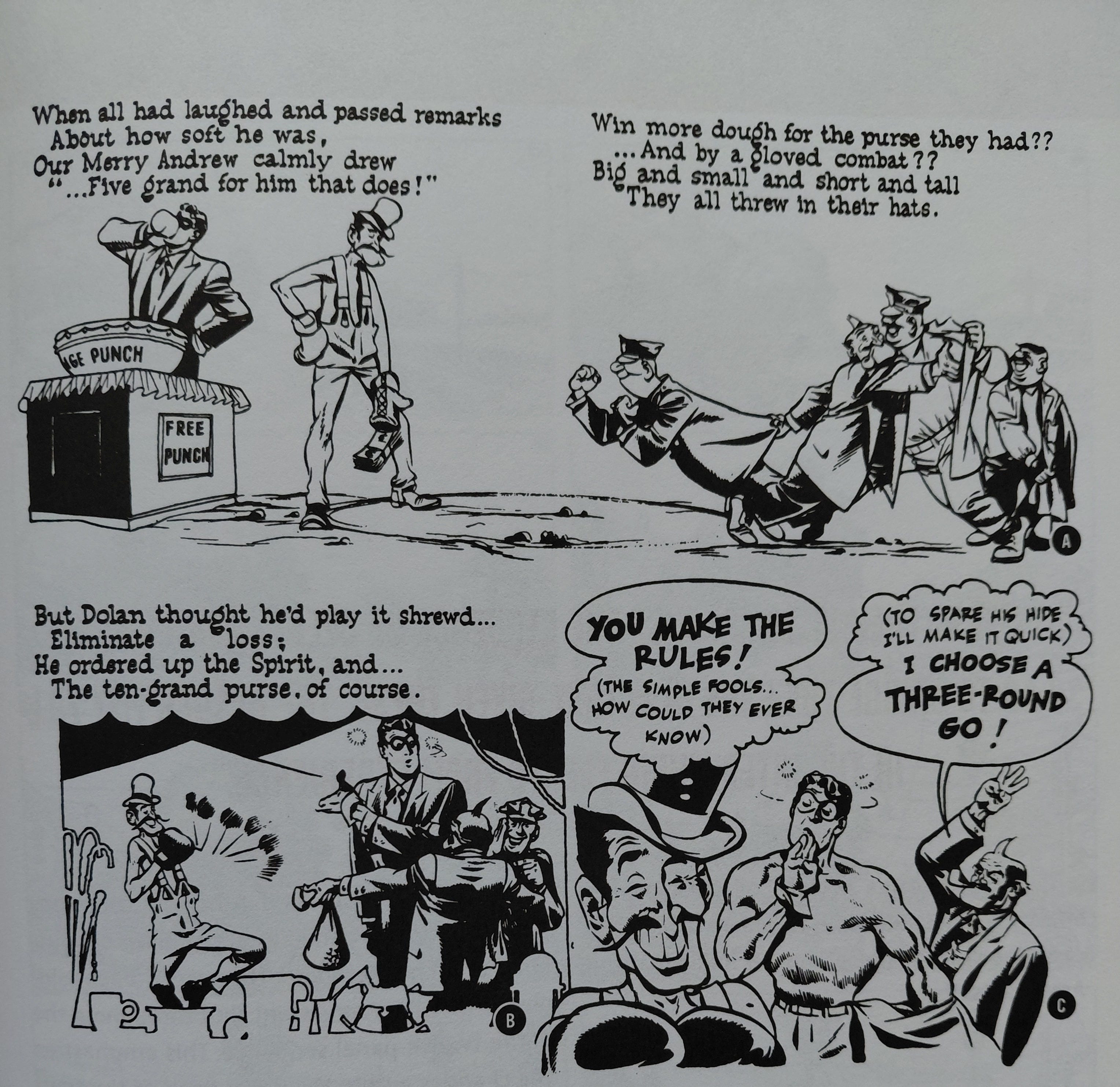
Eisner notes4, ‘The carnival set not shown here was displayed in the story's earlier pages. The reader us required to ‘fill it in’ now. On this page the open panels are intended to imply unlimited space and the suggested setting.’
Non-frames therefore don't just entail the removal of the panel border, there is an absence of background, either partially or wholly. As above, Eisner argued that this implies ‘unlimited space’, but McCloud shows the absence of backgrounds to suggest that ‘the world ceased to exist’. This means that in the non-frame/vignette/open panel is at that specific point in time, the object/subject is THE explicit focus, nothing else is important. The world at large is not shown because it doesn’t matter in the story at that precise panel, or it doesn’t matter as much as what is shown in the non-frame or open panel at that precise point.
Gutters are a temporal (non)marker which can imply that time has moved on within that white space, depending on the nature of the panel-to-panel transition. So by opening the panel/frame the drawn subject/objects exists within the gutters. This is somewhere outside the world contained within the panels. I'm not necessarily arguing here that I think that Eisner was wrong, it's just that vignettes are highly subjective depending on one’s perspective of formalism in comics.
I also think that calling these non-frames is misleading, because by removing the panel border, the holding line around the subject/object essentially becomes the frame. However, there is no panel because there are no panel borders. I guess I am arguing after all that Eisner was wrong. So, anyway, I prefer to call these open panels.
I think that open panels are a spacetime device which can be used to add value to a subject or object at a precise point in the story. Removing that panel border changes the meaning of the drawing. It also looks pretty cool, because let's face it, comics are also about graphic design.
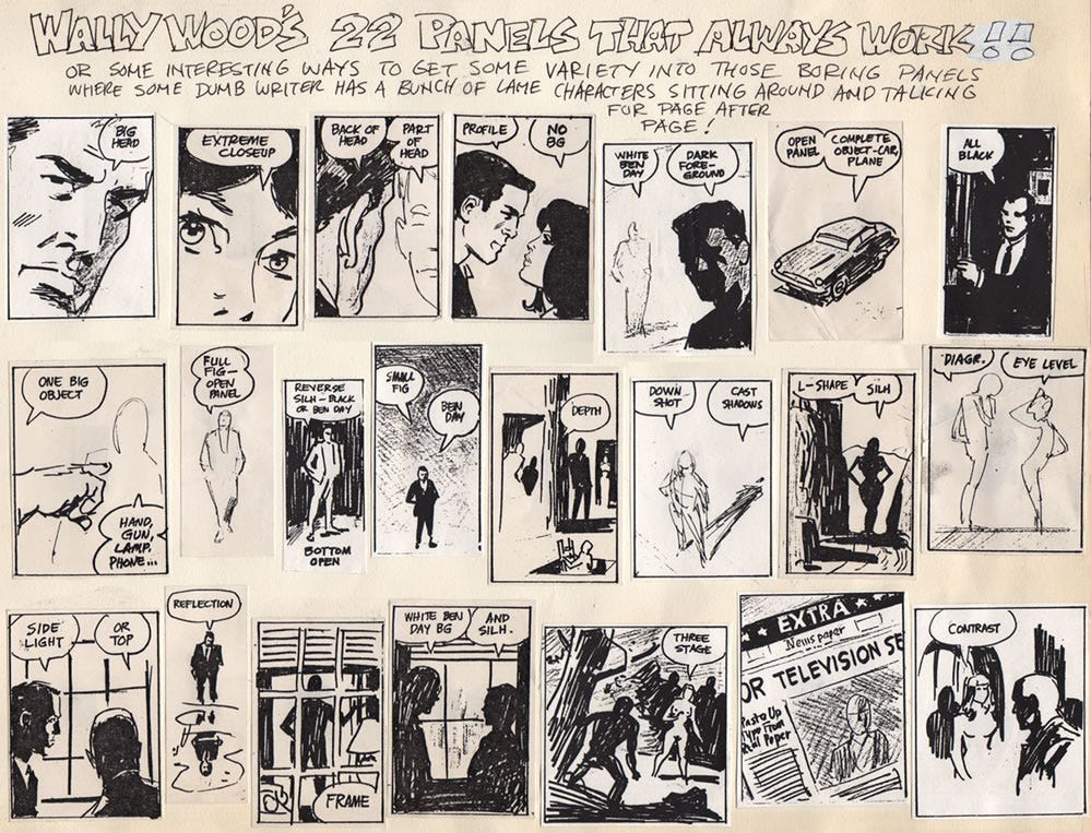
Chaykin’s quote above relays vignettes (aka non-frames aka open panels) back to Wallace Wood's 22 Panels That Always Work, which is shown directly below. Panels six, nine, ten and seventeen explicitly present open panels. Panel ten is only open at the bottom.
In Chaykin's work then, the vignette/non-frame/open panel serves three functions:
Isolation of a subject/object,
Punctuation of a story beat, i.e. a narrative device,
Emphasis on graphic design
There is a fourth function when the subjects/objects are shown fully - Chaykin uses a ‘floating head’ or classical bust variation of the technique. Using full figures (or an object) along with ground space (white space) and some background element present together the illusion of deep space, with Chaykin adding,
‘Here’s an example of that vignette, that abstract shape. I was going through at that time an absolute obsession with the painter and photographer of the 1930s and ‘40s named Charles Sheeler […] he was a guy who photographed factories and he painted graphic abstracts based on his photographs and on factories. They were just a brilliant example of industrial design as applied to fine art. A lot of the designs and layouts come from Sheeler here […] I like to see their feet, I like to see ground plane, I like to see a world in which the world exists even if it’s in a vignette, we’re convinced that the character exists on a ground plane.’
Eisner emphasised the importance of the frame as a narrative device5, ‘A frame's shape (or absence of one) gives it the ability to become more than just a prosciutto through which a comic's action is seen: it can can become a part of the story itself. It can be used to convey something of the dimension of sound and emotional climate in which the action occurs, as well as contributing to the atmosphere of the page as a whole’.
This isn't just propounding non-frames as a narrative device, but emphasising the importance of page design. Steve Rude's Nexus work provides numerous examples of both functions occurring concurrently.
Eisner goes on to add that non-frames are one of several panel types that bring the reader into the action, which Chaykin expounds as ‘the voyeurism of comics’, or presents the action ‘to “explode” toward the reader’6 Of course, this depends on what the subject/object is doing in the non-frame. I would argue that a more effective way of exploding the action off the page is foreshortening and breaking the panel borders.
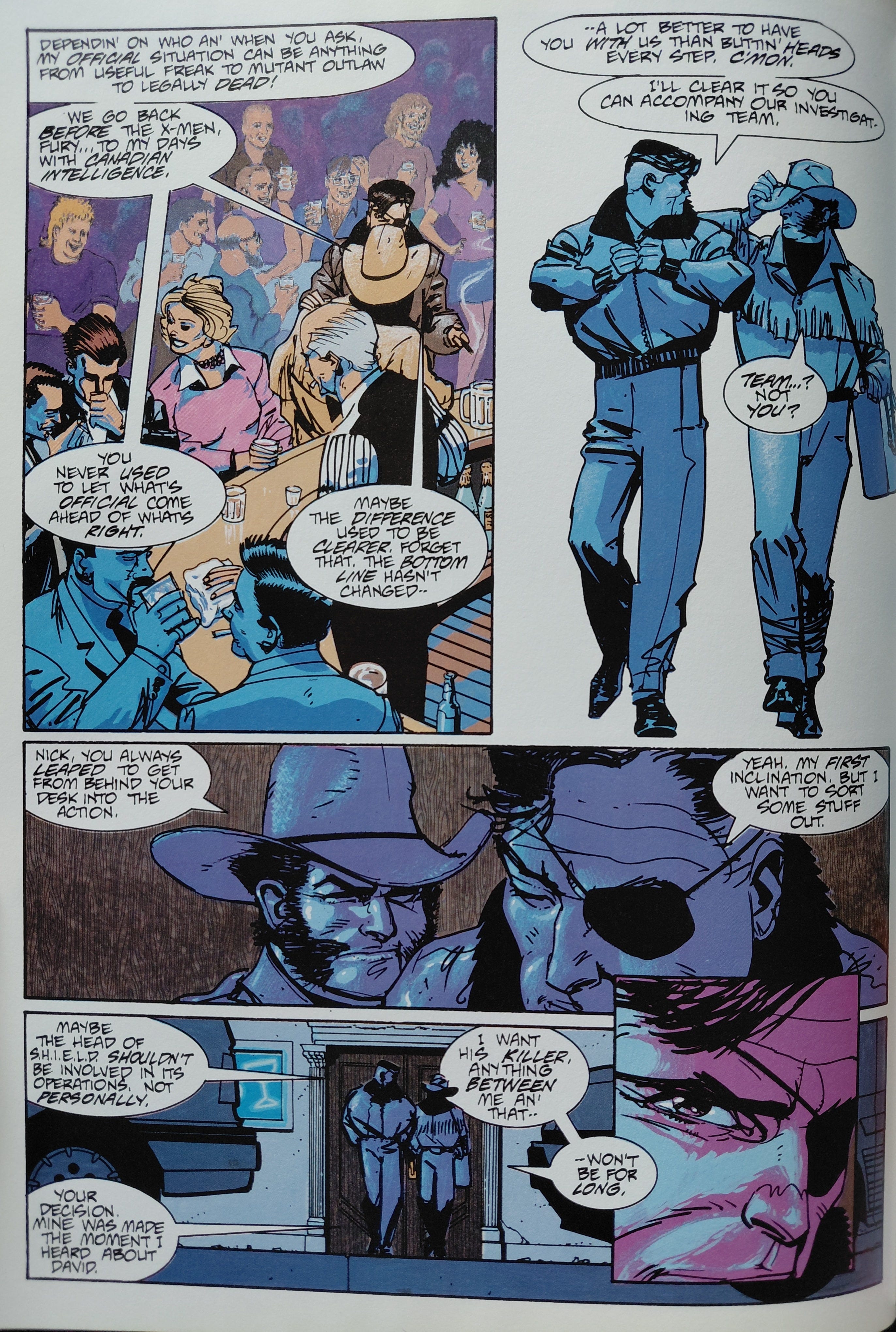
One thing that Eisner and Chaykin don't really get into is the efficiency of the open panel. Very early on I noticed John Byrne’s habit of dropping backgrounds in panels. (This was pretty common across marvel Comics, to be fair.) At first I thought was to draw attention to subjects, but the more I saw the more I realised it was to save time and hit deadlines. This infamously reached its apex on ‘Snowblind’ in Alpha Flight #6 (1984). John Buscema would also also drop backgrounds on fight scenes, but this did seem a purposeful means to focus attention on figures, but I wouldn't be surprised if his usage stemmed from efficiency too.
The efficiency argument can be extended to open panels seamlessly, but the question remains of its effectiveness. From memory, Byrne and Buscema didn’t make extensive use of open panels, which makes me wonder if their comics progenitor, Jack Kirby, didn’t either.
The Toth page above is interesting because he puts two vignettes together on that first tier. Toth implies an invisible panel border in the first panel by delineating the points where the fence goes off-panel. Off course, the open panel fits perfectly with his notions of efficiency. He draws a panel border around background elements in panel two, but leaves the ground space open. A common thing Toth did was to drop the border around narration boxes and this is the case in panels three, five and six in the middle tier. This means that he is emphasising the text within the narration box in panel four. In this case, it is to emphasise geography. He uses that middle tier as a narrative vignette, a four panel alternative to an establishing shot. It's a great example of Toth combining narrative and graphic design devices. This affects the pacing too with the staccato alternative to a widescreen establishing shot, it emphasises sequence above a static image.
An alternative to the use of an open panel to punctuate an emotional beat is the Mazzucchelli Dolly Zoom, which uses the expressionistic application of colour alongside a shift from realism to expressionism in style (or vice versa).
These alternatives work well in comics because they are typically specific to comics, although Spider-Man: Into the Spiderverse has successfully applied these techniques in film.
I wonder if the punctuation effect of the vignette works well on the page not just due to the isolation - the equivalent of a spotlight in a play or musical - but because the white space of the gutters bleeds in, implying a moment hanging in time. Or that isolation of image can symbolise isolation from the world, as a form of loneliness in the moment. This underlines the importance of gesture or expression in the vignette. the open panel also serves to underline the importance of what is being ‘said’ in the word balloons or narration box within the field of the open panel.
However, I think it's more than that, even. A panel is typically the container for a moment, in a vignette the subject/object us the container. Thus, the vignette personalises the story beat to that subject/object. With two figures or more, this is implicitly specified to the relationship between them. I think then that this could also be used to represent the relationship between people and place, that is, showing a building and a person.
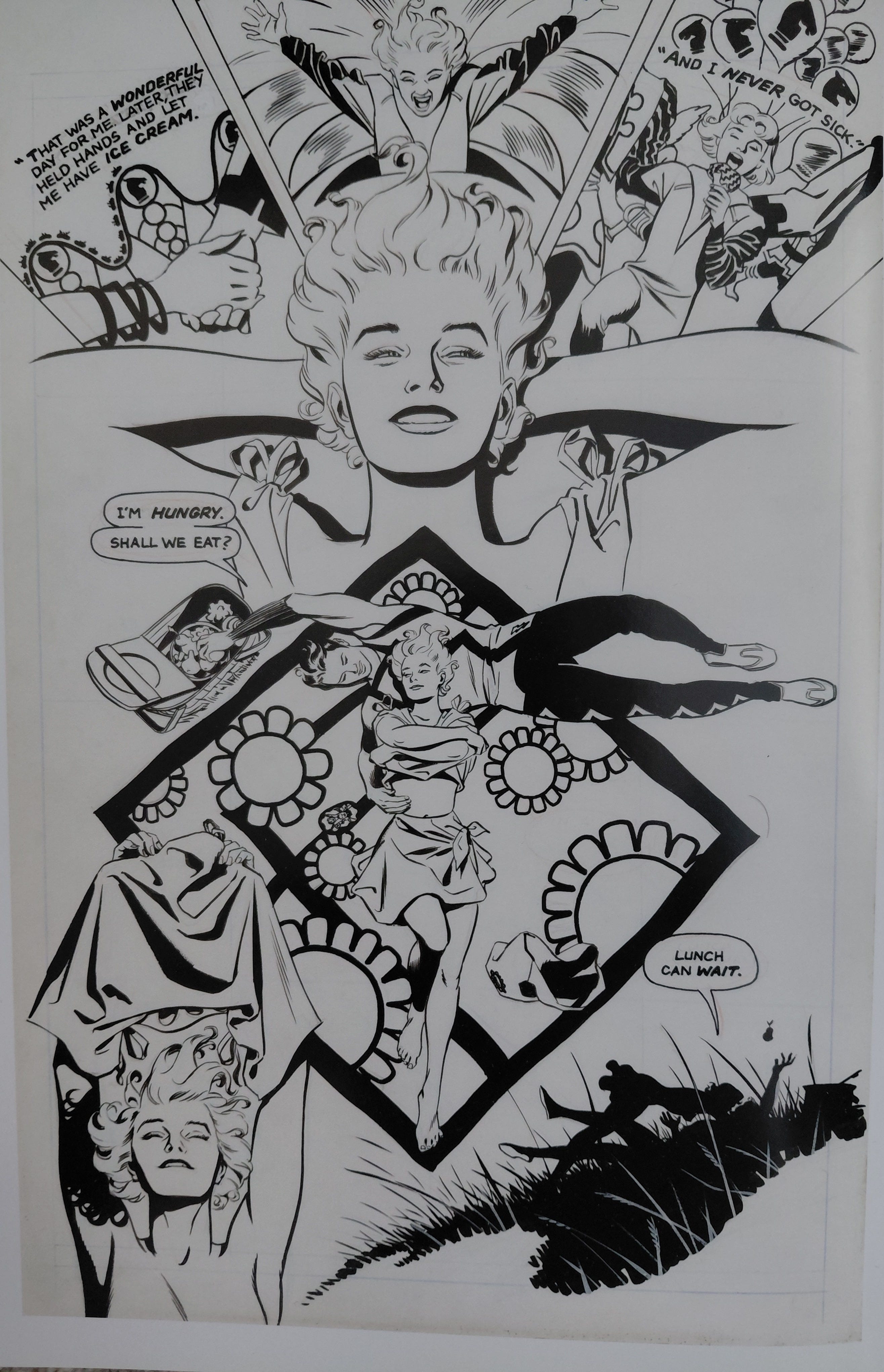
The Sienkiewicz page above fascinates me as it subverts formalism in a seemingly innocuous but powerful way, presenting a six panel grid with five vignettes, with the exception providing a pause in the scene and suggestively underscoring an emotional note. I wonder how the scene would have felt had the five vignettes been placed on a middle tier set to the Krigstein Rhythm, with panel three presented as a horizontal panel on the first tier and repeated on the third. Following Chaykin's argument on the real estate of the page, this stretches the sequence over time and asserts the importance of Stick over Elektra. That change in layout thus changes the emotional nuances of the page, as well as shifting the narrative value. For other offbeat examples of open panels, it is well worth looking at Sergio Toppi's work.
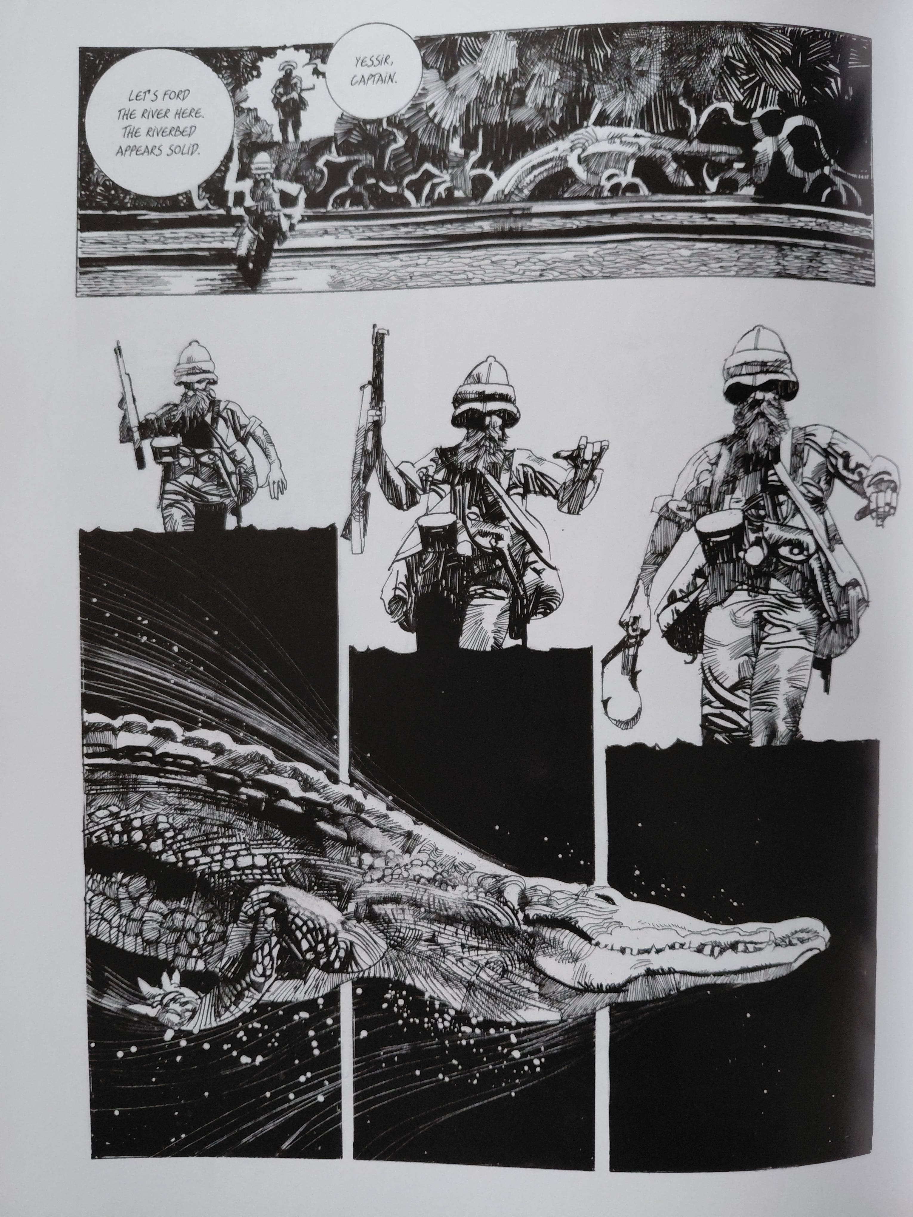
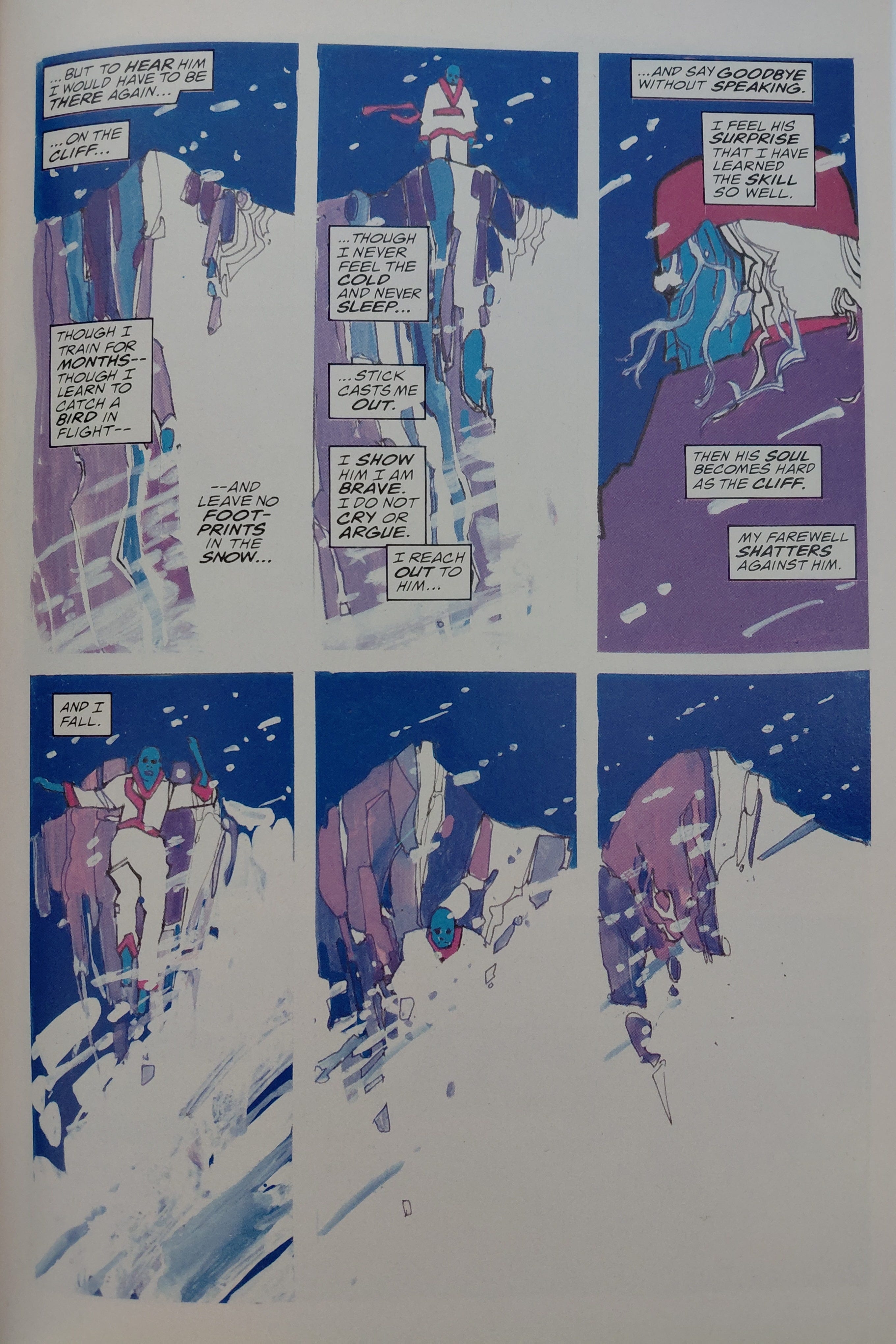
The Toppi page above is interesting as Toppi vertical flips Wood's partially open panel, emphasising open air rather than ground space. This puts the emphasis on the black depths of the river and the danger lurking within. Toppi doesn't use a polyptych to imply movement, relying instead white motion lives and splatter. I think a polyptych would have worked more effectively as a comics device, this feels more like a collage. I often feel that story is a secondary consideration to grapgic design for Toppi. That aside, the linework is absolutely stunning and it is a mesmerising page design. At some point I really must compare and contrast the hatching and noodling in Toppi and Frank Bellamy's inks.
Of course, all of the above works if the comic is printed on white paper, remembering Chaykin's dictum that ‘white space between the panels means nothing’. Conversely, opening the panel, allowing white space to bleed in, that means something. I'm not sure if it therefore follows that the whiter the page, the more potent the vignette.
I would add a caveat to Chaykin's suggestion, as I think that white space equals nothing, but it means something. What that something precisely is highlights the wonderfully provocative nature of comics (and literature and art), the intent of the artist and the interpretation of the reader. Most importantly, it relates to the established rhythm of the narrative and page design that it disrupts (or conforms to).
My Comics
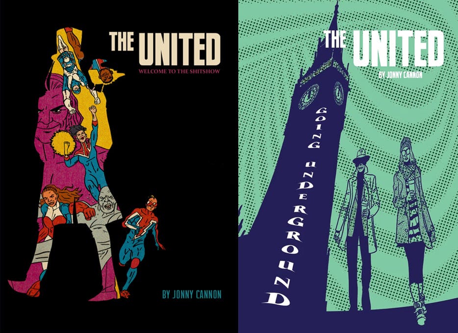
My comics and some of my original art are available from my online store. The United: Welcome to the Shitshow and The United: Going Underground are also available in a discounted bundle for only £30. International shipping prices are (surprisingly) not too bad just now and all orders outwith the UK come with a free A5 sketch on top of the free A5 sketch that comes with all orders of The United. I guess I must either love drawing or I’m desperate to get rid of my back stock from the garage.
I've used open panels a fair bit in my own comics, perhaps too much on occasion. However, when it comes off it's pretty cool. The page below if from The United: Going Underground. I used the open panel for the second panel to emphasise Boudicca’s gesture. That clenched fist is supposed to emphasise her rage. It’s also a set-up to the pay-off on the next page, so this is very much Chekhov’s Fist, if you pardon the expression.
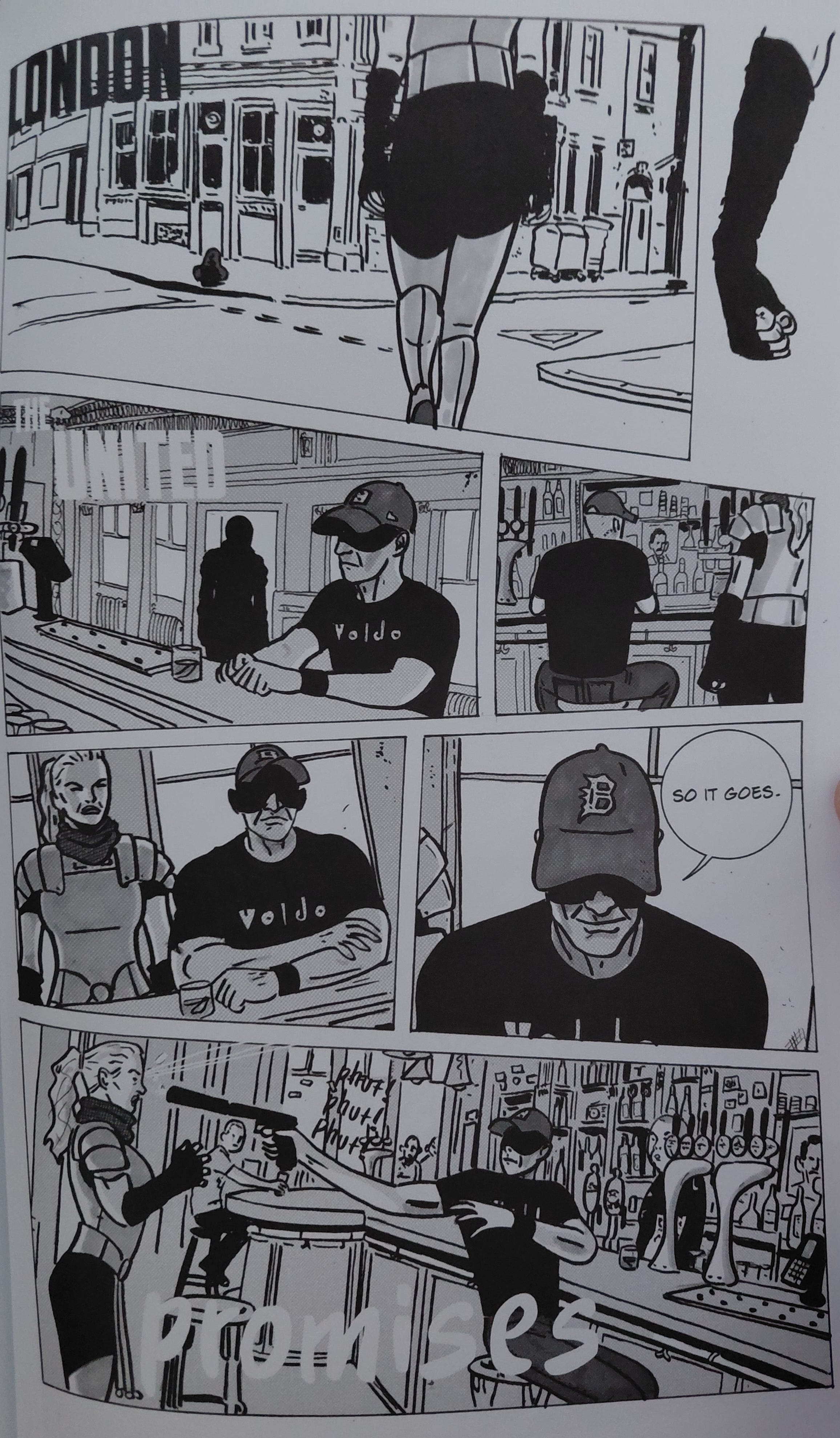
I like how this page turned out and I’m quite proud of it. I really enjoyed drawing this beer taps, which is perhaps not surprising as I’m a recovering alcoholic.
Next Time!
It’s time to reflect on some of my own process again: the do-over.
There's something to be said about the visual application of String Theory in comics too, come to think of it.
Eisner, W. (2008) Comics and Sequential Art: Principles and Practice from the Legendary Artist, W. W. Norton & Company, p.44.
McCloud, S. ( ) Understanding Comics: The Invisible Art, Harper Collins, p.99.
An excerpt from The Spirit newspaper strip, reprinted in Comics and Sequential Art, p.45.
Ibid., p. 45.
Eisner, W. (2008) Comics and Sequential Art: Principles and Practice from the Legendary Artist, W. W. Norton & Company, p.
I'm not sure why, exactly, but in my own manga project I most often attempt to tell the story without panel borders when I'm recounting something from the ancient past. I also try to use a style that evokes old ukiyo-e prints... However, when I actually design those scenes, I always think of Eisner. His borderless pages in "A Contract With God" made a big impression on me.
Thanks for showing a few more examples here. I was familiar with Mazzuchelli's and Sienkiewicz's pages already, but the Steve Rude and Toppi pages you showed were new to me and they are simply beautiful!
I just finished Batman: Year One for the umpteenth time. Although the story has always been weak and rushed, Mazzucchelli's art, pacing and composition are masterful. This is my favorite Batman's story and just because of its art. Speaking of open panels (and I read your piece before re-reading the comic), the way they break the pacing and bring attention to specific details before redirecting the readers into the action is just perfect.