
Expressionism in Comics
Wherein I drone on again about chiaroscuro and gush over Frank Miller in particular

Noel Sickles is generally recognised as the cartoonist who introduced chiaroscuro in comic strips with Scorchy Smith before it became popularised and increasingly influential through his studio-mate Milton Caniff’s work on Terry and the Pirates. Chiaroscuro is an Italian term that describes the balance between light and dark in fine art, film and comics. ‘Chiaro’ means ‘bright’ or ‘light’ and ‘scuro’ means ‘dark’. Fundamentally it’s about contrast, not just black and white. It’s particularly associated the film noir of Hollywood in the 30s and 40s, which in turn was influenced by German Expressionism of the 1910s. I’ve banged on previously about the interconnectedness of film, comic strips and comic books (here and here) and the importance of contrast in inking (here), but I didn’t get into the broader influence of expressionism in comics (mostly because I know f*** all about art besides comics and film).
There’s a pretty great feature on expressionism here, that I found particularly informative. It puts forward three defining characteristics of expressionism:
Strong brushstrokes, with the use of geometric shapes
Stark forms, sometimes creating two-dimensionality
Subjectivity, emphasising what exists in the artist’s head than what exists in reality
That last point seems critical for me in identifying expressionism in comics. Frank Miller’s initial run on Daredevil is narratively and thematically influenced by noir, but it’s very much grounded in reality. So much so that his peers took the piss off him for climbing out on rooftops to sketch water towers. Artistically, he seems really influenced by German Expressionism in Sin City. It’s not just an exaggeration, so much as the expression of a feeling. I guess that’s why it’s called expressionism.
Bill Sienkiewicz notes, ‘You'll see a lot of people using photo reference now, and they'll have somebody yelling, and it's a little bit restrained -- stiff -- as opposed to the jaw's dislocated, and just the emotion of someone yelling’1.
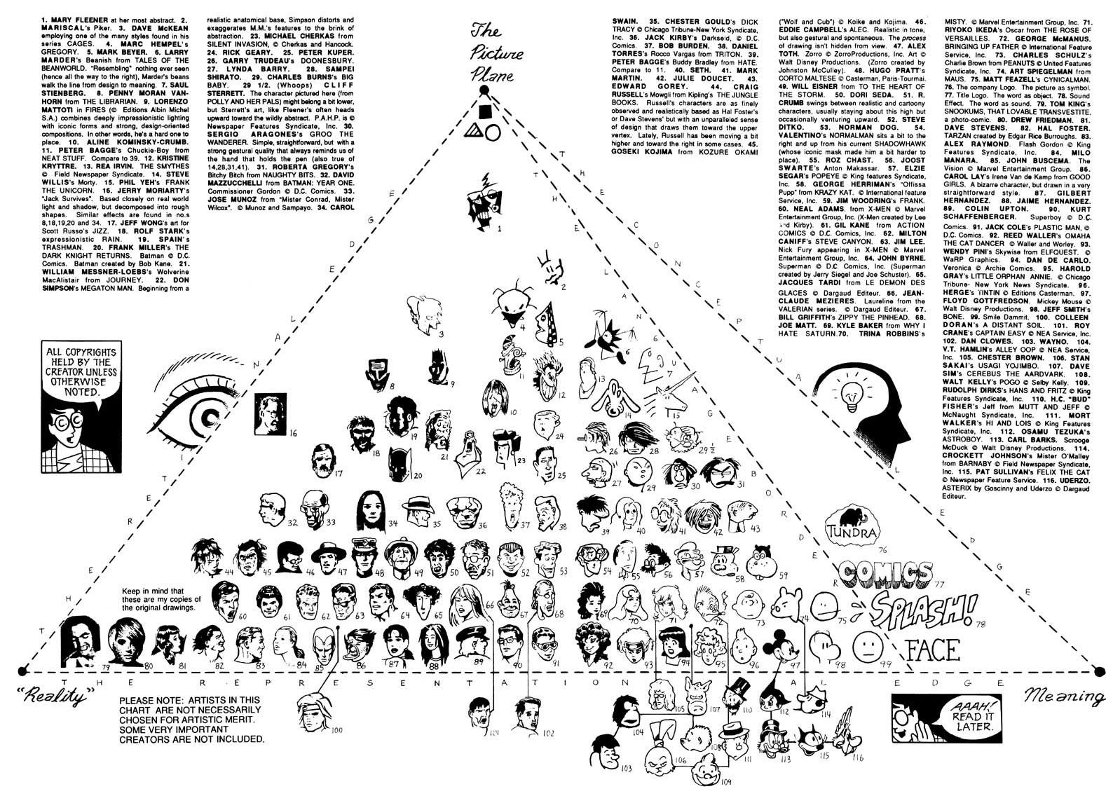
Scott McCloud writes about this in Understanding Comics, with his ‘Picture Plane’ diagrammatically placing comic artists somewhere between ‘reality’ and ‘meaning’, or to put it another way, degrees of expressionism or abstraction.
I didn’t go to art school and any talent that I have managed to refine is based on autodidactism, so my knowledge of art history beyond comics and film is pretty limited. From what I’ve been able to piece together, it seems that the emergence of expressionism around the end of the 19th Century lines up with the mainstreaming of comics in Europe and the UK up to World War 1, before being filtered through German silent cinema in the early 20th Century in the works of Fritz Lang, F. W. Murnau, G. W. Pabst, and Ernst Lubitsch. The Dutch tilts, upshots, chiaroscuro, femme fatale and so on then hugely influenced film noir in American cinema of the 1930s and 1940s, which had a symbiotic relationship with US newspaper strips, particularly Milton Caniff’s work on Terry and the Pirates. But Caniff’s work is still pretty grounded in reality and most newspaper strips that I’ve seen seemed influenced by more classical illustration. Winsor McCay is maybe a good example of surrealist ideas presented in an illustrative style. George Herriman’s work on Krazy Kat seems to fit abstract expressionism more, with regards to style. I’m also really struck by how expressionistic Frank Miller’s later work on Sin City is, or the abstract expressionism of Bill Sienkiewicz’s run on New Mutants or Elektra: Assassin.
Anyway, here are some examples of chiaroscuro that I really like, which show varying degrees of expressionism.
Corto Maltese
There’s a very interesting article on the year-long exhibit of Hugo Pratt’s work at the Musée des Confluences, held over 2018/19, that can be found here. It mentions the influenced that Caniff had on Pratt, ‘While still a boy, Hugo Pratt discovered the early American adventure comic strips and was so enamoured with Milton Caniff’s Terry and the Pirates that he decided to become a cartoonist. He wasn’t alone. Caniff’s bold, chiaroscuro graphic approach and flair for exotic dramatic storylines influenced virtually every aspiring adventure cartoonist of the era’.
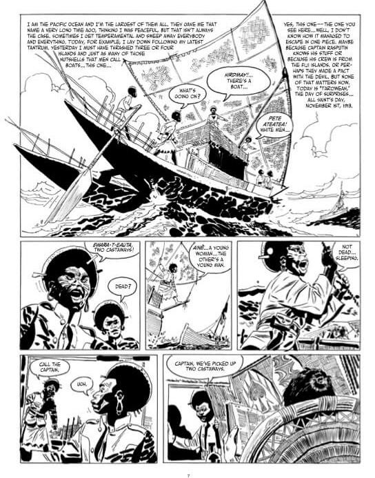
The article, pulling from Dean Mullaney’s introduction to a collection of Terry and the Pirates, quotes Frank Miller thus, ‘I was studying Corto Maltese…strictly for the brush work… [It] greatly informed how I did Sin City. The brevity of it goes all the way back to Milton Caniff. But Pratt had his own edge that I found fascinating and like nothing else I’d ever seen. I wanted to learn from it and integrate it’.
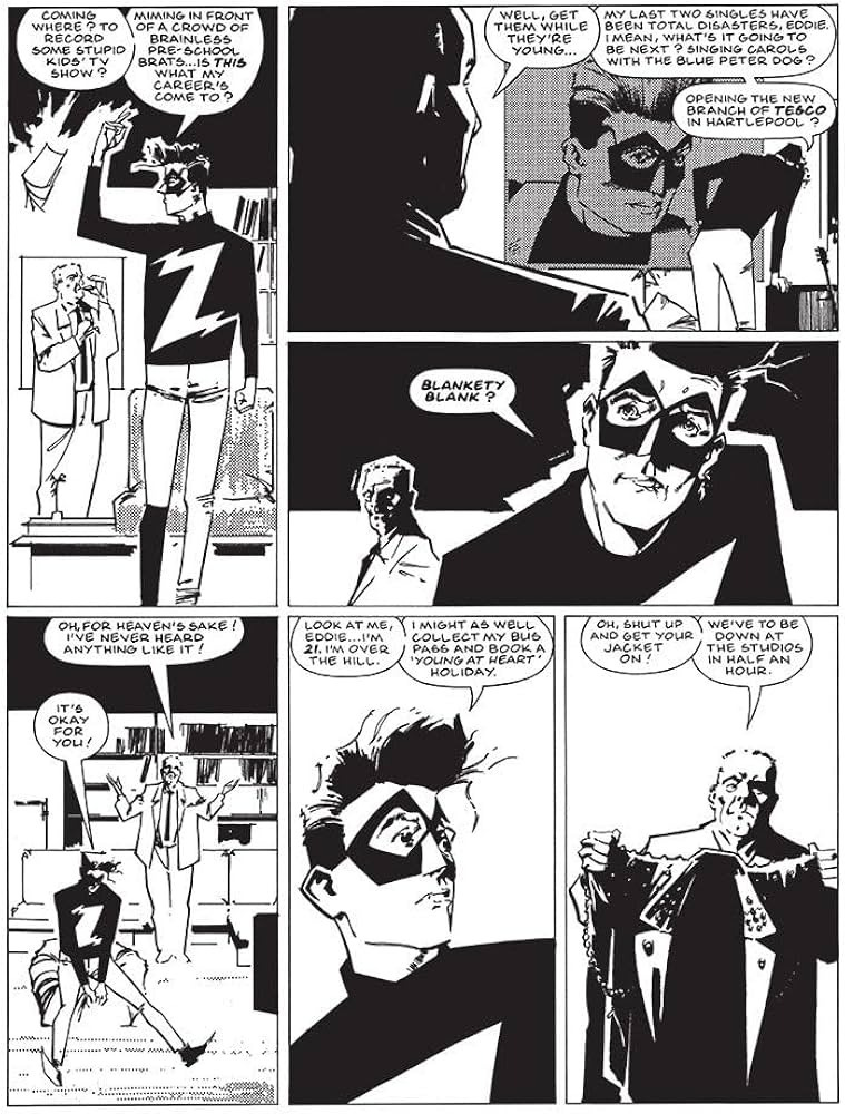
Zenith: Phase Three
I am a big fan of Grant Morrison and Steve Yeowell’s Zenith strip that ran in 2000AD during the 80s and early 90s. Yeowell’s style varies quite a bit over the course of the original four phases, with his line-work becoming sharper and his inking much more dependent on chiaroscuro. Phase Three seems to be heavily influenced by a shift towards expressionism, much as Morrison’s later writing on Doom Patrol is heavily influenced by Dadaism and surrealism.
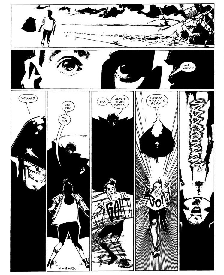
I think Phase Three is the apex of Yeowell’s work on the strip, the subsequent introduction of colour shifted the emphasis away from him spotting blacks with audacity - those heavy brush strokes. I love the contrast of his sharp line of his crow quill and the blobs of black ink that he spread across the page in Phase Three. Occasionally the storytelling suffers as his expressionistic style becomes perhaps a bit too minimalist, but it’s beautiful, daring work. Generally speaking, I much prefer 2000AD prior to the move to full colour. That 1980s shift to Metal Hurlant ‘light’ stepped away from strong storytelling, effective page design and art in service of the story to painted comics that arguably emphasised the money shot over storytelling. (That’s not to say Simon Bisley’s work on Sláine is naturalistic, but it owes more to Frank Frazetta than it does to German Expressionism.)
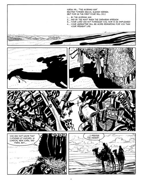
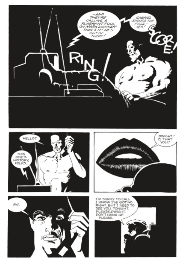
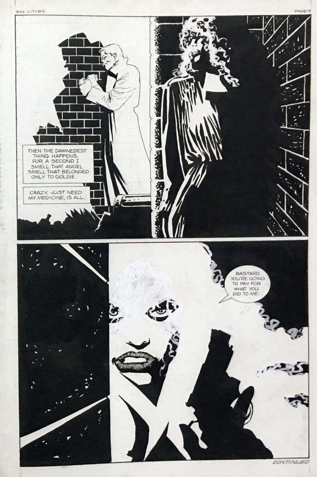
Sin City: A Dame to Kill For
I was lucky to first discover Frank Miller’s work in black and white when it was reprinted in The Daredevils, published by Marvel UK. Probably the first work of his I saw was the classic fight between Daredevil and the Hulk, reprinted in The Daredevils 4. It certainly left an impact on me, but it owes more to Gil Kane than the films of Fritz Lang. I really like the first couple of volumes of Sin City and the art takes that expressionism, chiaroscuro and noir to a different level.
Quite a bit has been written about the influence of film noir on Frank Miller and he gets into that in Eisner/Miller. But he’s also mentioned the huge influence of Max Fleischer’s Superman cartoons2, which seem to melt German Expressionism and art deco together. One thing I love about Miller’s approach is that he learns from so many sources whether it’s Hugo Pratt, Goseki Kojima, Crepax, Gil Kane, Jack Kirby, Steve Ditko, Alex Toth, Fritz Lang, Max Fleischer, Stanley Kubrick and on and on. Those broadened horizons almost certainly explains the evolution of his style. It seems that some comics fans are resistant to this change - and Miller’s change in particular - and I wonder if that’s because the art form of comics is quite insular. For example, there’s a prevailing notion that Ditko’s influence on Dr Strange was influenced by drugs, whereas a much more plausible explanation to me is that he read some books, or went to exhibitions, on Dadaism or Surrealism.
It’s funny, this wee essay was originally just going to focus on inking comics, but I got a bit carried away and it all got a bit intense.
A Random Comic Cover That I Dig
To lighten things up, here’s a comic cover that I really like. It’s not really random, as I mentioned Daredevil above. This Mazzucchelli cover is from Denny O’Neill’s short spell writing the character, squeezed in between Miller’s runs on the title.
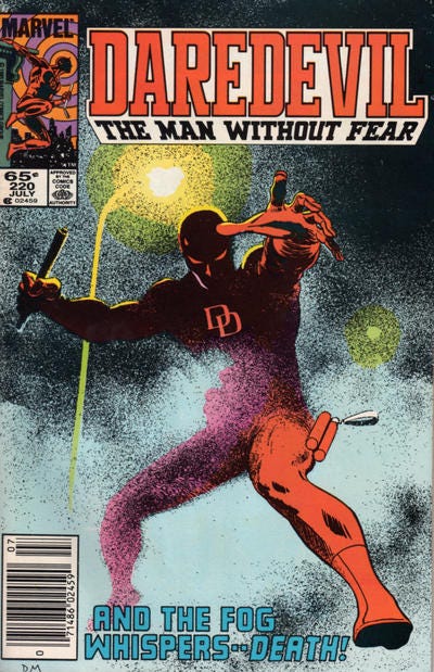
I’m assuming Mazzucchelli used a stippling or pointillist technique on the cover, as it looks too deliberate to be splattered. I waxed lyrical on Frank Bellamy’s pointillist inking here. There’s great use of Kirbyesque foreshortening here too. The leg placement makes me think of Gene Colan’s earlier run on ol’ Hornhead too. If anyone knows David Mazzucchelli then please ask him if he will make more comics.
Next Time!
I don’t know, I feel I need to learn more about Bill Sienkiewicz and abstract expressionism and Jim Woodring and surrealism. Then again, I might be boring the living shit out of everyone - let me know in the comments below!
See: https://laist.com/news/entertainment/bill-sienkiewicz-marvel-x-men-studio-tour-photos
See: https://ew.com/books/2019/10/02/pop-culture-of-my-life-frank-miller/
“Bill Sienkiewicz and abstract expressionism and Jim Woodring and surrealism” sound interesting to me (recently got a copy of One Beautiful Spring Day I’m itching to read). Great piece, I think Frank Miller’s art owes more to expressionist/noir cinema than expressionist art.
Steve Yeowell’s drawing a Commando.