
The Do-over
Wherein I look briefly at an Alex Toth page, pore over some Warren magazines and then reflect on getting it wrong and trying to get better

Open Panels: A Brief Return
I have been experimenting with duotone effects on my new comic, The United: Five Triangles. The inspiration for this comes from various sources: Roy Crane, Howard Chaykin and Alex Toth.
I was looking through my copy of Genius Illustrated: The Life and Art of Alex Toth for the 8,000,000th time, looking specifically for the reproduction of the original art from Lone Hawk, originally published in Blazing Combat #2 (1966). Toth's use of tones in the feature is stunning, it's a truly beautiful six-page feature, made even more remarkable that it is made up entirely of open panels and that Toth is ‘drawing’ with duotone.
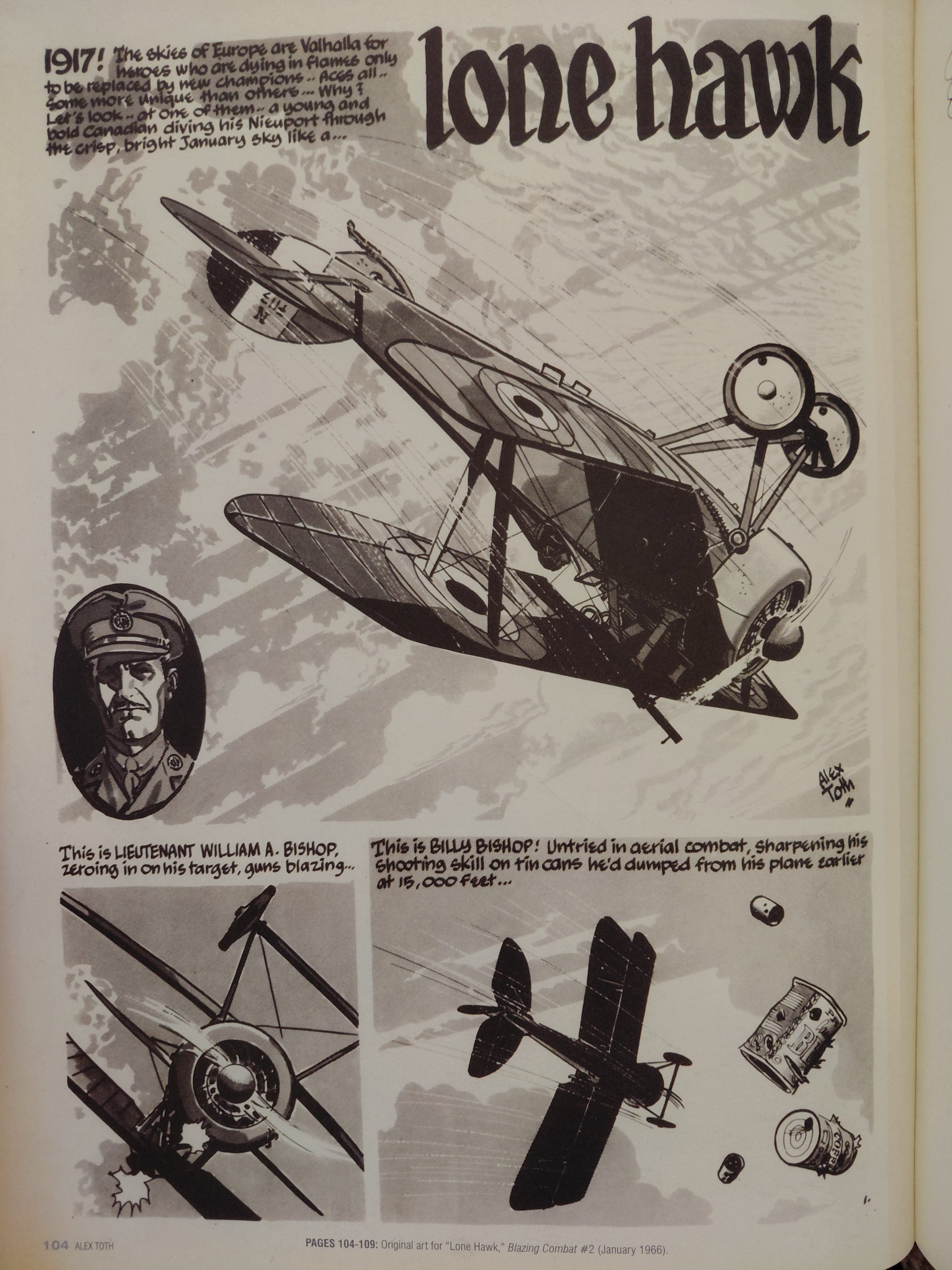
I can't think of anyone who captured the claustrophobia of the cockpit or the the majestic openness of the sky as well as Toth. That first panel above is dizzying, as Toth uses motion lines to represent velocity just as he juxtaposes the horizontal layers of the clouds with the tilted angle of the plane. Cutting to that tight crop in panel two is functional rather than thematic, as it focuses attention on the blazing guns, while panel three shows empty cartridges and falling tins with bullet holes. In three panels Toth therefore presented the place, theme, main character and a degree of insight into the protagonist's motivation. As beautiful as the page is, the design is in service to the story.
It All Comes Out in the Wash
I'm a real sucker for Warren Publishing's magazines. Publications including Famous Monsters of Filmland, Help!, Creepy, Eerie, The Rook, Vampirella, 1984, 1994, Blazing Combat, The Goblin and The Spirit contained some stunning comic features by a murderers’ row of artistic talent, including Harvey Kurtzman, Will Elder, Robert Crumb, Gilbert Shelton, Jack Davis, George Evans, Johnny Craig, Wallace Wood, Russ Jones, Angela Torres, Frank Frazetta, Joe Orlando, Al Williamson, Al McWilliams, John Severin, Reed Crandall, Russ Heath, Neal Adams, Gene Colan, Vic Prezio, Ken Kelley, Vaughan Bode, Basil Gagos, Larry Todd, Tom Sutton, Bernie Wrightson, Jeff Jones, Frank Brunner, Wayne Howard, Mike Kaluta, Bruce Jones, Ralph Reese, Kenneth Smith, Richard Corben, Ken Kelly, Paul Neary, Bill DuBay, Rudy Nebres, Alfredo Alcala, Alex Niño, Gil Kane, Carmine Infantino, Bob Larkin, Pablo Marcos, Jordi Penalva, Frank Thorne and Will Eisner.
Vampirella opened the door for a slew of Spanish artists, including Pete Gonzàlez, Esteban Maroto, Lyus Bermejo, Vincent Alacazar, Luis Garcia Mozos, Martin Salvador, Leopoldo Sanchez, José Ortiz, Sanjuliàn and Enrich.
A murderer’s row indeed. And, of course, I purposely ignored two names from those lists, Steve Ditko and Alex Toth. Arguably, both Toth and Ditko produced some of their finest comic art for the publisher, which really is saying something.
In The Illustrated History of Warren Magazines: An Illlustrators Special, Peter Richardson writes,
‘Some of this talent were artists such as Neal Adams, who was soon to make a name for himself on DC's Deadman, while others were veterans of the comics industry who had grown disenchanted with the exploitative nature of mainstream comics publishers such as Marvel and DC. Alex Toth and Steve Ditko were two such creatives, the latter having recently fallen out with Stan Lee and resigned his Spider-Man gig. Revelling in the ability to entirely craft their own work rather than to be part of of the assembly-line process favoured by the larger comic book publishers, both men would create some of their most exciting work within the pages of Creepy and Eerie. Their use of ink washes on one story and then beautifully finessed line-work on another added an extra zest of unpredictability to what had become a very formula-driven industry.’
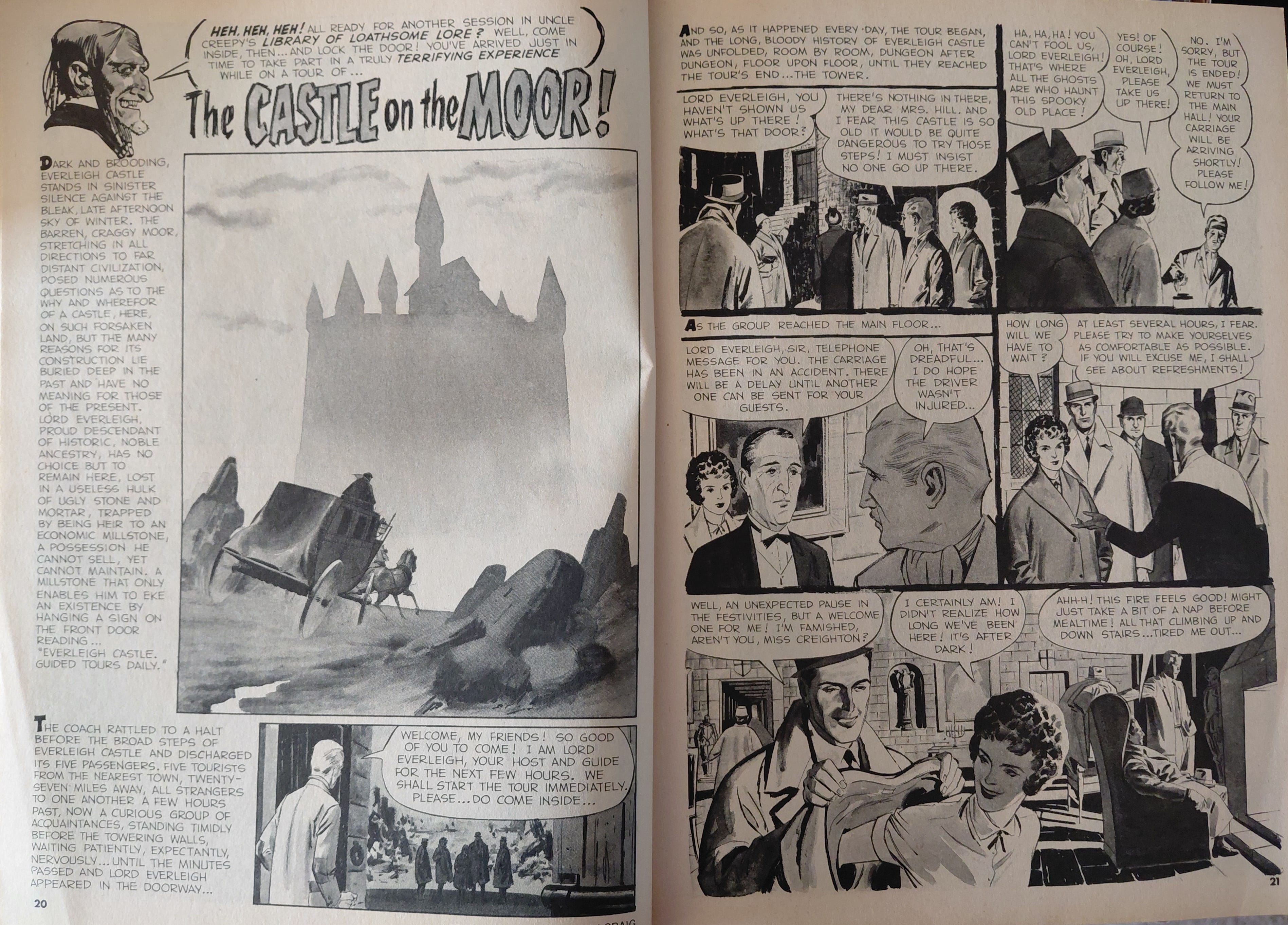
Below are some pages from issues of Creepy and Vampirella that I have. These provide examples of the different ways that ink wash techniques can be applied in comics.
I was looking the other day at Goya's Vision Fantástica/Asmodea (1820-1823) and it reminded me of Craig's half splash page above. (That likely says more about my immersion in comics than anything insightful about art.) I associate Craig with that masterful line and very specific brushwork, so it's almost shocking to see him doing a wash and drop that definitive holding line.
Panel five on that second page is simply stunning. It's right up there with the very best panels that Toth ever drew and the inking is the equal of anything that Wood ever did. Craig's defining linework is there to see on the page, with the exception of that striking half splash page, which is precisely why is stands out so much - the juxtaposition is so pronounced. This work is truly sublime.
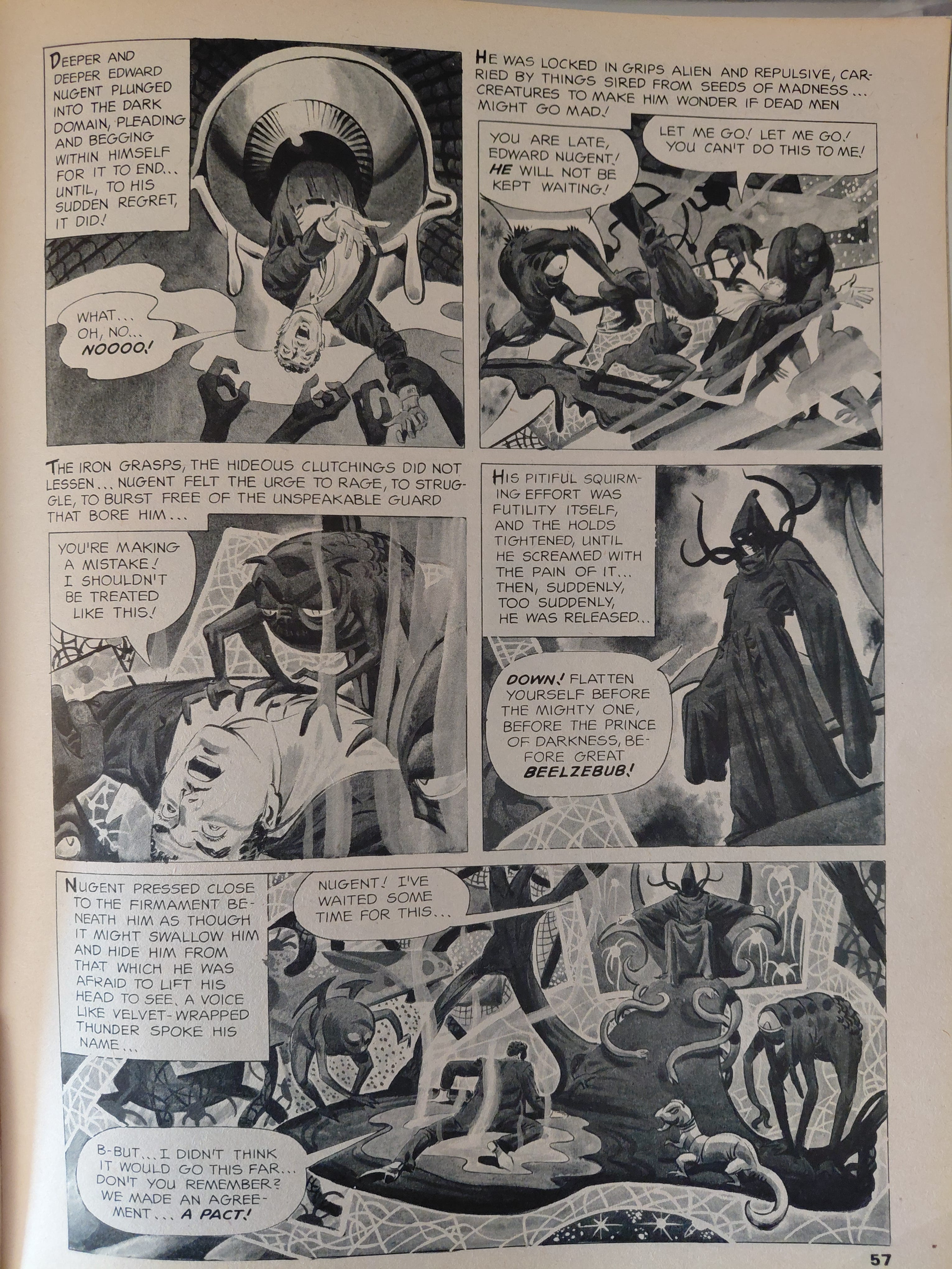
Ditko's ink wash is gorgeous and his innately off-kilter, slightly grotesque style is such a great fit for delightfully deranged stories. His storytelling at its best is arguably peerless. There's a lot of text on tbe page, but the strength of Ditko's drawing is such that it balances out. The page above dials the approach he took on his Doctor Strange run right up to 11. It's the stuff of nightmares. Every panel here is just knocked out of the park into Crazyville.
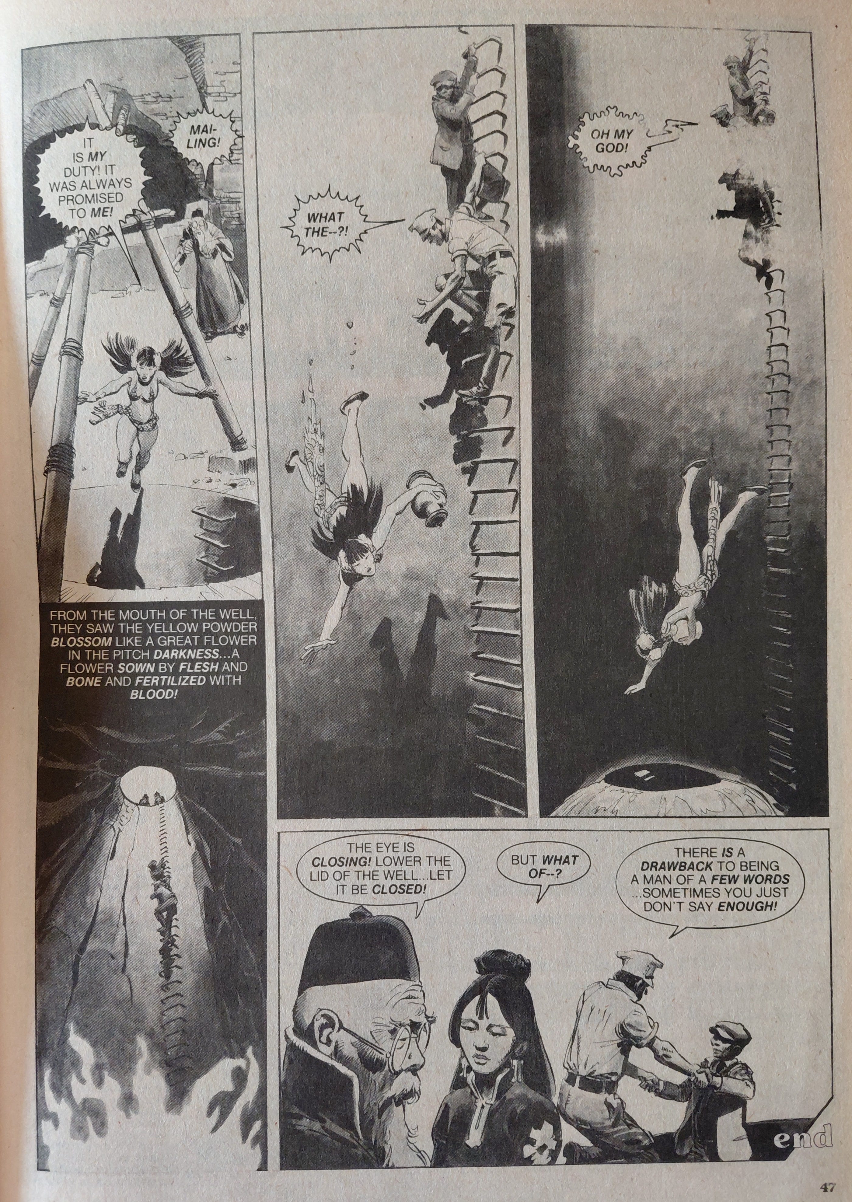
Bermejo's page is also jarring, possibly because I associate him most with his work in British comics of the 60s. Comparing and contrasting the page above with the chiaroscuro of Johnny Future is a fascinating way to pass the time. Bermejo's work here is jaw-dropping, although I don't think the storytelling is as clear as it should be.
Panel two feels somewhat superfluous, panel four is confusingly positioned and panel three would be even more effective if it was the full height afforded by the grid. Still, I find it hard to see past the beautiful inking on those rungs; panel three would not be out of place in a top tier manga.
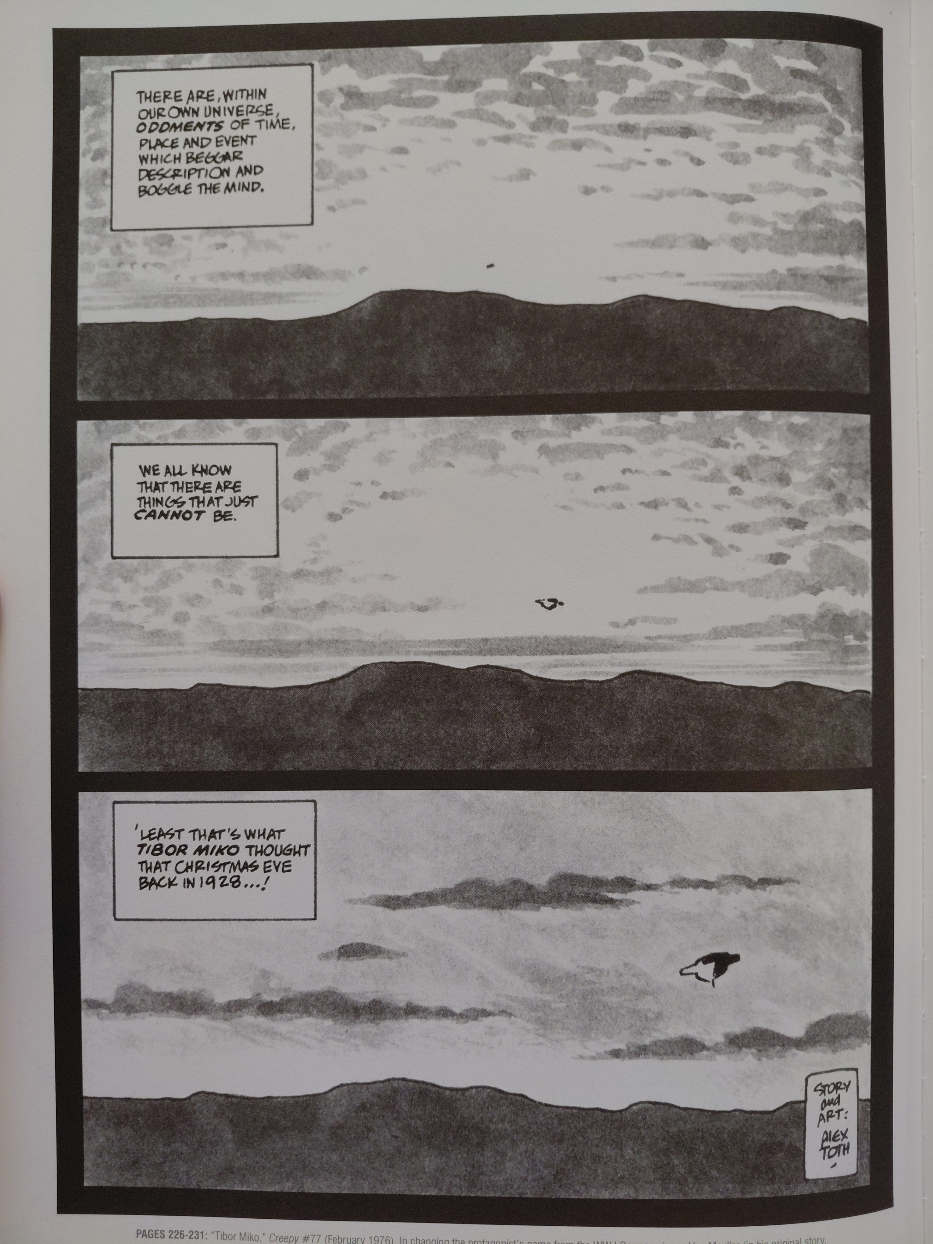
The Toth page above is seared into my brain. I love the simplicity of the composition and the mesmerising effect of that three-panel establishing shot. This is a perfect page design that reminds me why three is the most important number in storytelling. Toth creates an ominous note with this three-panel scene. It's so simple and so effective. That off-centre placement suggests something unnatural is happening. Something is wrong. The juxtaposition of the flying object with the peaceful sky suggests silence, which adds to the eerie atmosphere.
It never fails to amaze me that Toth could so much with so little. What a genius.
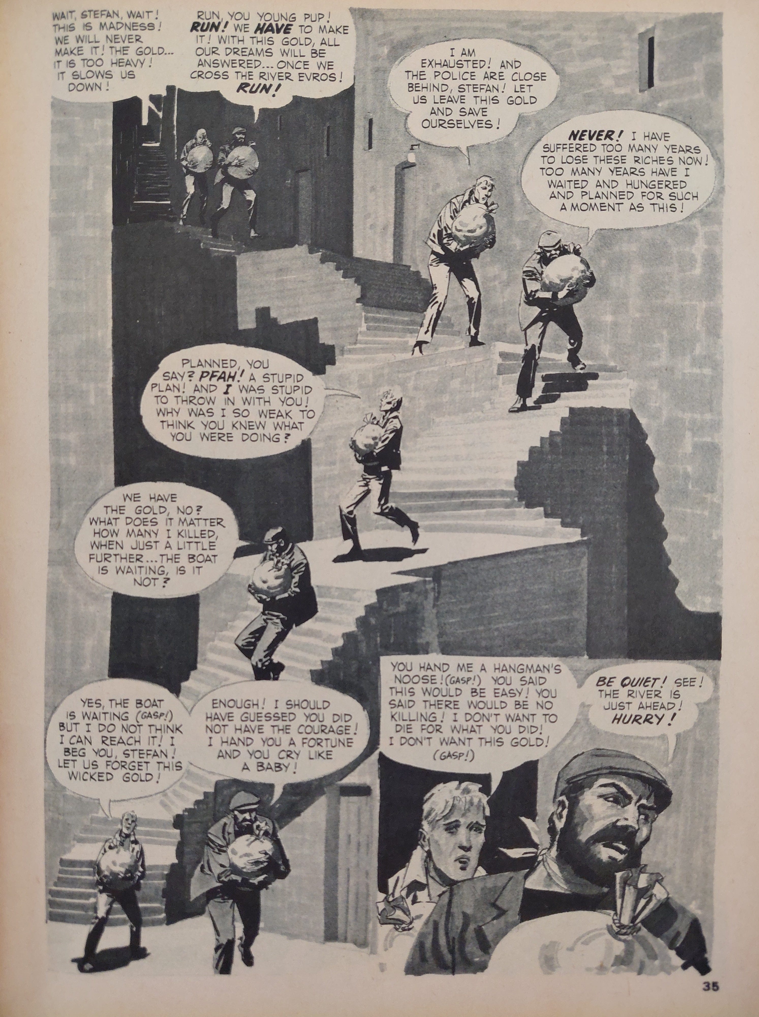
A stunning use of the Meskin Effect, with the body language drawn to imply hard labour rather than speed. Craig drops that trademark crisp pen line here, but the telltale facial expressions, educated drapery and incredible lighting are there. The wall texture is subtle, yet masterfully done.
The use of open panels, with no white space adds to the dialogical emphasis on the weight of the gold. (Thematically, the burden of greed.) There is no panel border, so there is no pause, no implied respite, no break from their burden. Everything is on-panel.
This makes me think of Frank Miller's bird's eye application of the Meskin Effect in Elektra Lives Again, as well as Frank Quitely's technically magnificent stair and bridge polyptychs in The Multiversity: Pax Americana #1. Craig's compositional and storytelling approach is more straightforward, but it's effective and his use of the ink wash underlines his masterly application with a brush.
Knowing When to Stop
I'm a big fan of David Fincher's work in film and TV. Zodiac is one of my favourite films and Mindhunter is one of my favourite TV shows. Both provide masterclasses in building suspense and a tangible sense of dread. I've read interviews with the director and several of his collaborators and a pervasive theme is his perfectionist approach to film-making and there's the rub, as there's no such thing as perfection in art. This is particularly the case when commerce intersects with art. Certainly, Fincher is aware of this, saying, ‘They say, and it’s true, movies aren’t finished, they’re abandoned. And you have to make your peace with that’.
Still, that commitment to excellence and the willingness to push the medium reminds me of cartoonists that I admire, who understood or understand the craft to an incredibly high level and had or have the talent and doggedness to execute their ideas.
Something else has been in my mind recently. My friend Tony Esmond, a comics writer that I have worked with and someone with an encyclopedic knowledge of comics history, as well as a deep love and understanding of the craft, wrote recently, ‘Stop fooling yourself that it’s a masterpiece. Stop believing you are beyond criticism […] never, ever, believe the hype. It’s the last thing you should be reading’.
Now, I've spent over three years working on The United: Five Triangles and it will likely be another year until it's done. There's no deadline and therefore no need to ‘abandon’ the project. I can keep going until I'm really happy with it. Because of that lack of deadline I have at times found myself caught up in the throes of pontification and, somewhat delusionally, striving for something like perfection. To be honest, I have very occasionally wondered if I have found that elusive masterpiece somewhere within me.
I am a pretty grounded person, so that self-aggrandisement is always fleeting, punctured swiftly by self-deprication (and sometimes self-loathing). I despise arrogance, but belief is important and a very different thing, whether in relation to principles, values, a higher power or the self. These are all ideas in some shape or form and without ideas, craft is redundant.
I was lucky enough to get very good reviews for The United: Going Underground, and I'm very proud of the work I put in, tge craft I learned and the final comic itself, but I can still see all the mistakes that I made and instances where I should have made different choices. The most valuable reviews to me were ones that suggested areas for improvement. My pride in my work, my sense of professionalism as opposed to a sense of vanity, compels me to do better.
Criticism provides me with an insight on how to improve my craft, in lieu of a collaborator's input. Going back to Tony's point, hype is thus redundant in relation to self-improvement.
I don't wallow in self-loathing or waste time with self-flagellation (well, most of the time), as those mistakes excite me. Mistakes are opportunities to learn and get better. Put simply, flowers grow out of shit.
Underpinning everything I do now in comics is that Ditkovian mantra, ‘THINK’. I refer back regularly to Roy Crane's Scrapbooks, Wood's 22 Panels That Always Work and Toth's Points to Consider. These provide an analytical frame that informs my critical reflection on my work.
If this newsletter sometimes feels self-indulgent… well, that's because it is. These articles are my study-notes.
If At First You Don't Succeed
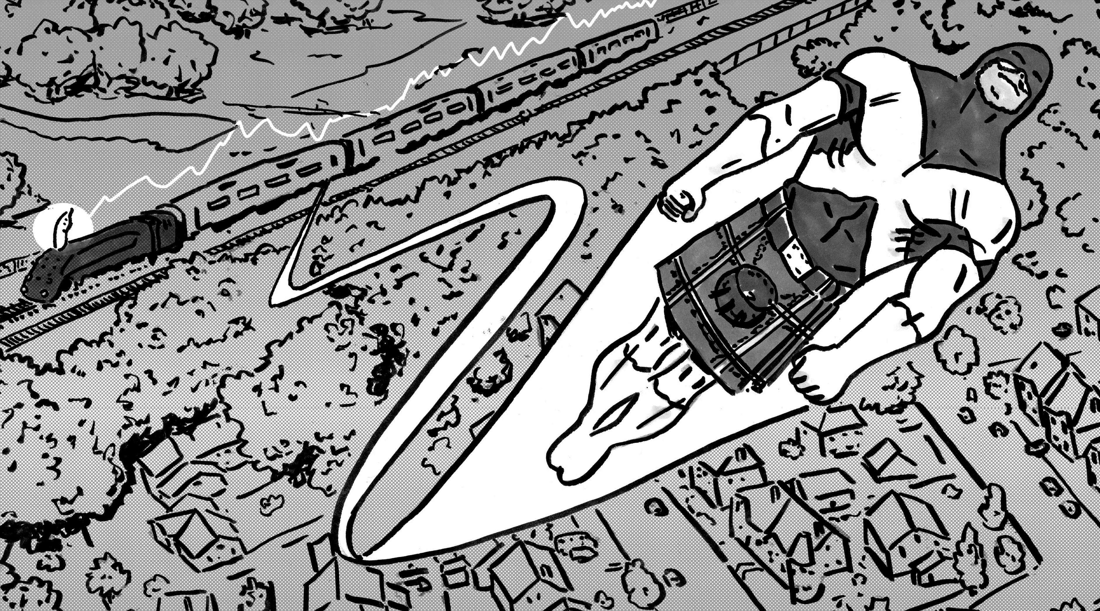
The page directly below was my first attempt at drawing a quiet scene in The United: Five Triangles, what Toth would have described as ‘pedestrian’, ‘unimportant’ or ‘dull’. He called these scenes, ‘bridges’. (See below.)
Drawing the page was thus perfunctory. It was only when I got to the final panel that I realised that I had let the train completely come off the rails. This wasn't due to bad planning, I knew the main beats of the page and noted these down. I had drawn roughs and laid out my page design in a thumbnail. It's just shite.
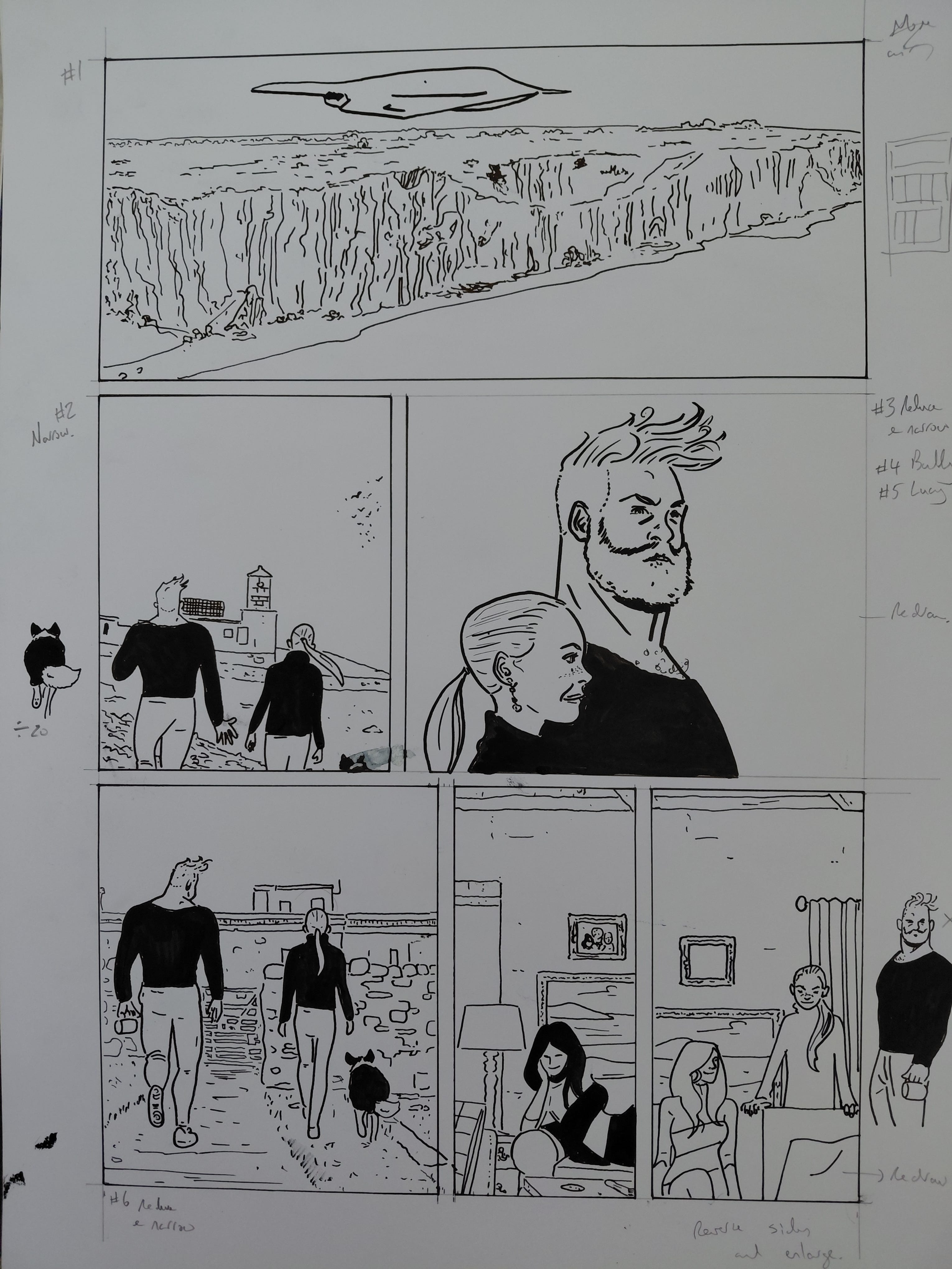
The page design is uninspired, the panel composition is dull, the cropping is ineffective, the gesture is weak, the characters are a wee bit off-model.
Frankly, I shat the bed and so I decided to redraw it, retaining whatever I could. This has happened a few times over the 130 pages so far, but those instances are typically a panel here and there, panels that aren't good enough and easy enough to fix by cutting and pasting a new panel on top.
The first thing I did was note the existing panels that could be salvaged, as these still contained the story beats that I wanted. I was only happy enough with panel one to remain unscathed. Panels two, three and four were not strong enough compositionally to justify the real estate that they occupied on the page.
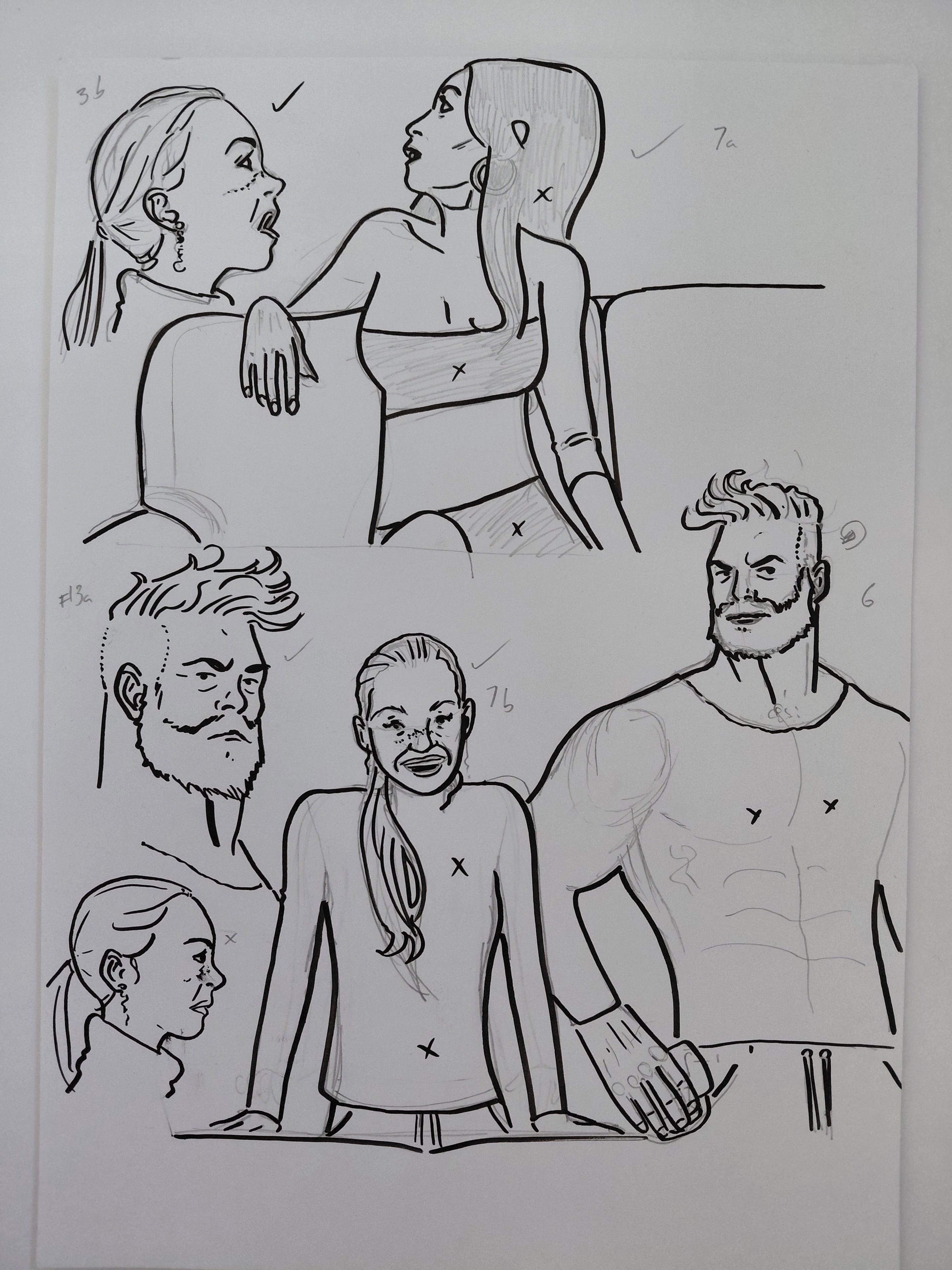
The faces in panel three were off-model and so I redraw these on an A4 piece of Bristol Board. I sketched an alternative to panel five too. I got the right gesture by looking in the mirror at how my hand was positioned over a chair, particularly in relation to my shoulder.
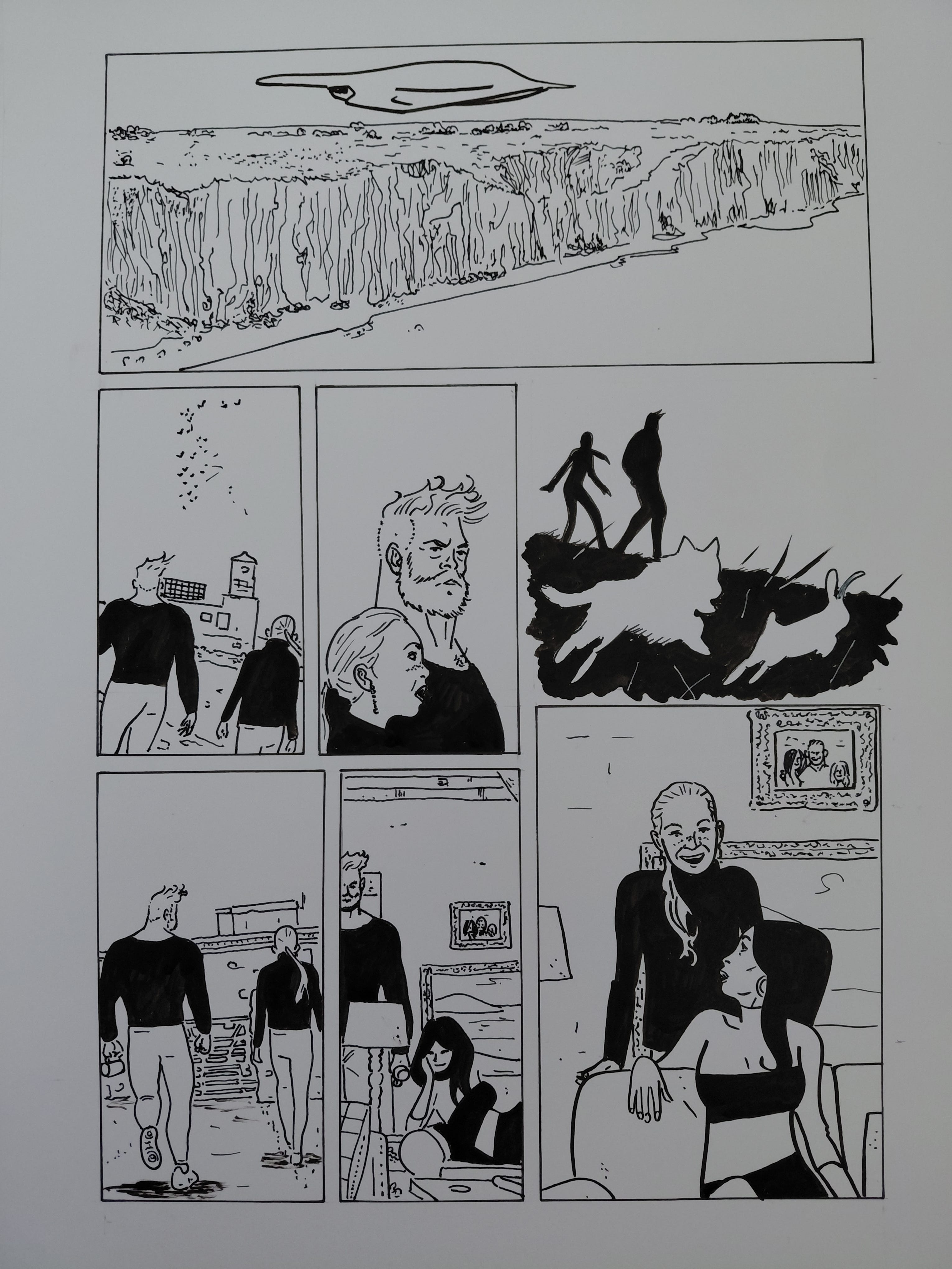
Panel three was the last element that I figured out. I knew I wanted an open panel to make the page more visually interesting.
I know I was going to use duotone on the page, so I opted to use silhouettes of the Mighty Scotsman's dog chasing a rabbit, which complemented the story beats. After drawing this, I realised that I had subconsciously riffed on an open panel from a Steve Rude page that I wrote about in my previous newsletter. I looked at that newsletter again and used a white gel pen to mimic Rude's beautiful blades of grass to further enhance the illusion of deep space. Of course, the silhouette also always feels like such a Tothian move.
I still wasn't happy with panel six, particularly the Mighty Scotsman's face, but it's a small drawing and I didn't want it be anything but an innocuous transitionary panel. I like the panel transition on the bottom tier, as the increased size of panel seven punctuates a note on the page turn. In this case it underlines the mother-daughter relationship.
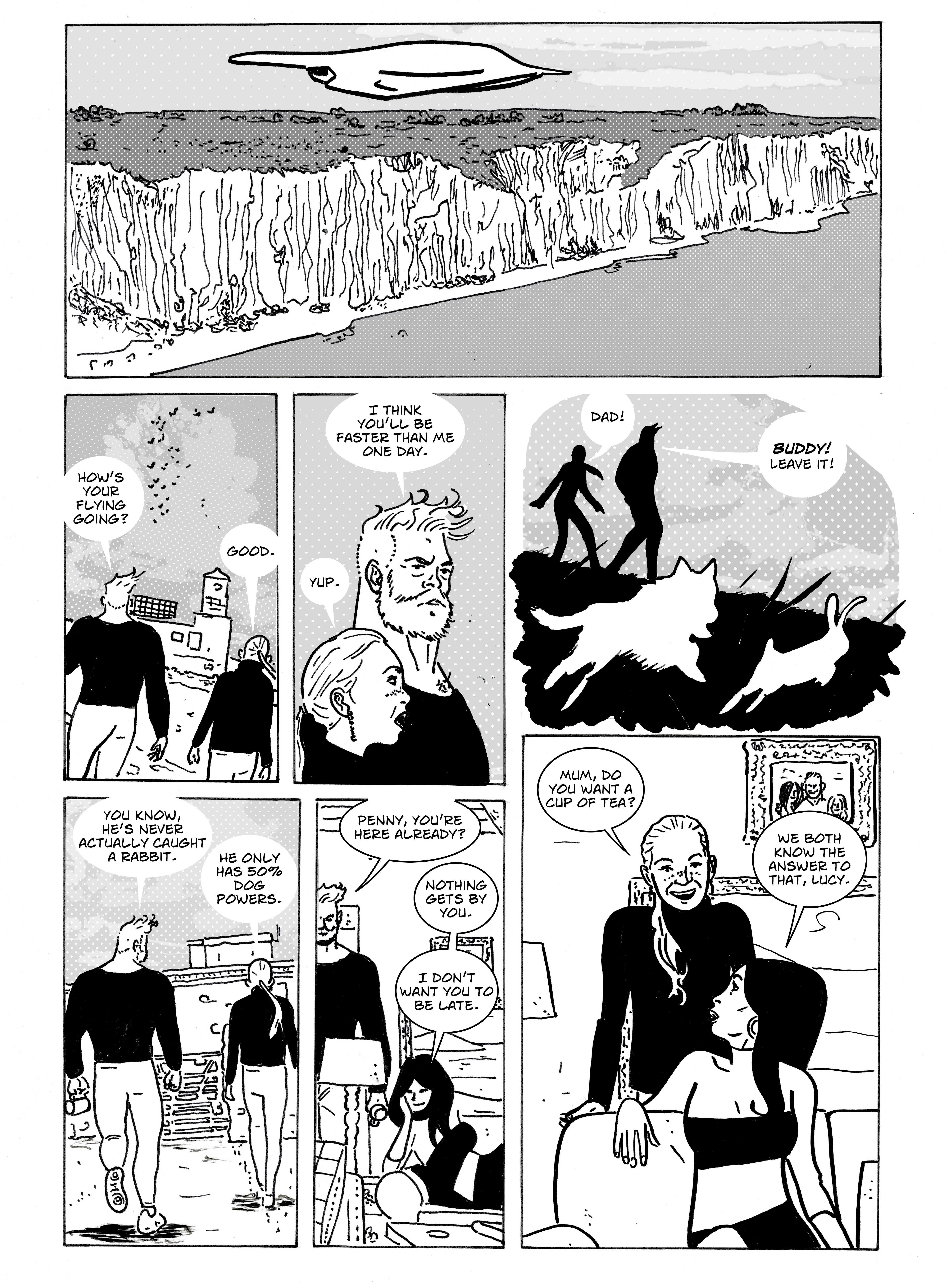
There’s a balance to be struck between refining a page and knowing when to move on. I don’t think that good enough really is good enough a lot of the time, but sometimes it really just has to do. The possibilities of the do-over are bounded by the practicalities of the deadline just as much, if not more so, than any limitations of craft or talent.
Again, this takes my mind back to Toth’s Points to Keep in Mind , specifically, ‘Be critical! Positively so!’
Or as Ditko put it, ‘THINK’.

The only surefire way to do better is to be better. That takes hard work in the form of study and practice. There is no shortcut in the journey to become better, but I think there’s peacefulness, contentment or happiness to be found in the continuous refinement of craft. Think, learn, work.
I do realise that I'm ranting at myself here, but in my defence it's really warm and Scottish people are 90% snow.
MY COMICS!
Forbidden Planet International has sold out again of copies of The United: Welcome to the Shitshow and The United: Going Underground. This provides some reassurance that someone somewhere is reading comics I've made. I will drop off additional copies when I get back from holiday in Cornwall.
Copies of my comics and affordably priced original art are also available at my online store, with special prices on bundles.
All physical orders of The United come with a free A5 sketch and international orders come with two free sketches.
Come to think of it, online sales have been quiet for a while, so it would be good to sell something. Especially since that copy of The Amazing Spider-Man by Steve Ditko Artist's Edition was expensive. (Don't tell my wife.)
Next Time!
I’m going on holiday and I’m taking with me a book on Jack Cole, some issues of Video Jack, DC: The New Frontier, Martin Amis’ Money and my Kindle. I will also be taking my sketchbook and pen-case.
Thanks mate. Your thoughts are always insightful.
Wonderful stuff. Thanks for this.