
On Alex Toth
Wherein I write a little bit about possibly the greatest American cartoonist ever

Above my drawing table there's a framed sketchbook page that Alex Toth drew in his later years, one of the hundreds (if not thousands) of doodles that he drew. This was an incredibly generous gift from a friend and I study it and admire it several times a day - I’m looking at it right now.
I look through books of Toth’s work every day. I study his work with an obsessed passion, convinced that the secret to my improvement as a cartoonist is locked somewhere within his work. If I look at his work closely enough, understand it properly, then I’ll become better at drawing and better at storytelling. That’s the idea, anyway.
It is no exaggeration to suggest that Toth was a genius, a true master of the comics form. Alongside Jean Giraud, I think he's the best I’ve ever seen. There's some kind of magic in his work. His level of craft is truly ridiculous. He makes difficult bits of draughtsmanship look effortless. His storytelling is just completely off the charts.
I sometimes sort comic artists - particularly cartoonists - into two broad categories of intellectual and instinctive artists (even though I don’t like reductivism as a rule). Steve Ditko and Jack Kirby are two respective examples. Howard Chaykin and Erik Larsen (respectively again) are two others. That’s not to say instinctive artists don’t think about comics, but it seems like they draw from the gut. That’s also not to say that intellectual artists don’t care about the medium, they clearly do, but there’s just something especially considered about their work. Scott McCloud almost certainly writes about this in Understanding Comics and, more than likely, frames it far more sophisticatedly than I do. Anyway, Toth is odd as he’s both intellectual and instinctive, but typically within that pared-down, deceptively simple style where you can clearly see just how impossibly good he was at drawing.
To find out more about Toth and his work, then I cannot recommend highly enough Genius Illustrated, Genius Isolated and Genius Animated by Dean Mullaney and Bruce Canwell. William Stout (who’s also an incredible artist) writes about Toth here, theres the superb Tothfans website and Comixcrush has a brilliant series of YouTube videos called Toth In Depth here. Jim Rugg is a huge admirer of Toth’s work, so he was frequently mentioned on Cartoonist Kayfabe. Toth is a comic artist’s comic artist, so there’s lots of writing out there about him.
In my previous newsletter (here), I focused on time and space in comics and asked Gregg Schigiel what he thought about it. I wanted to show a couple of examples of how Toth was able to demonstrate this in his work.
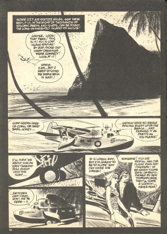
That first panel bewitches me. Last week, Gregg and I mentioned the use of polyptychs and the De Luca Effect. Here, Toth uses both by merging foreground palm trees with black gutters. With this one technique he breaks the panel into three images to imply the passage of time, create tension and add depth. I don’t know for sure if Toth saw this somewhere else and applied it or created it by accident, but it seems like a deliberate choice to me. It’s truly remarkable. I’ll also go back to Howard Chaykin’s point that I mentioned last week, that ‘white space is imperative between the panels because it means nothing’. Here, Toth uses black for the gutters because it means something. It implies doom, that walls are closing in, a sense of claustrophobia. The gutters aren’t panel borders, they’re prison walls. They also allow the foreground elements of the palm tries to have that dual functionality. Interestingly, the third tier breaks an unwritten rule of page design by utilising left-sided stacking, but it works well enough here.
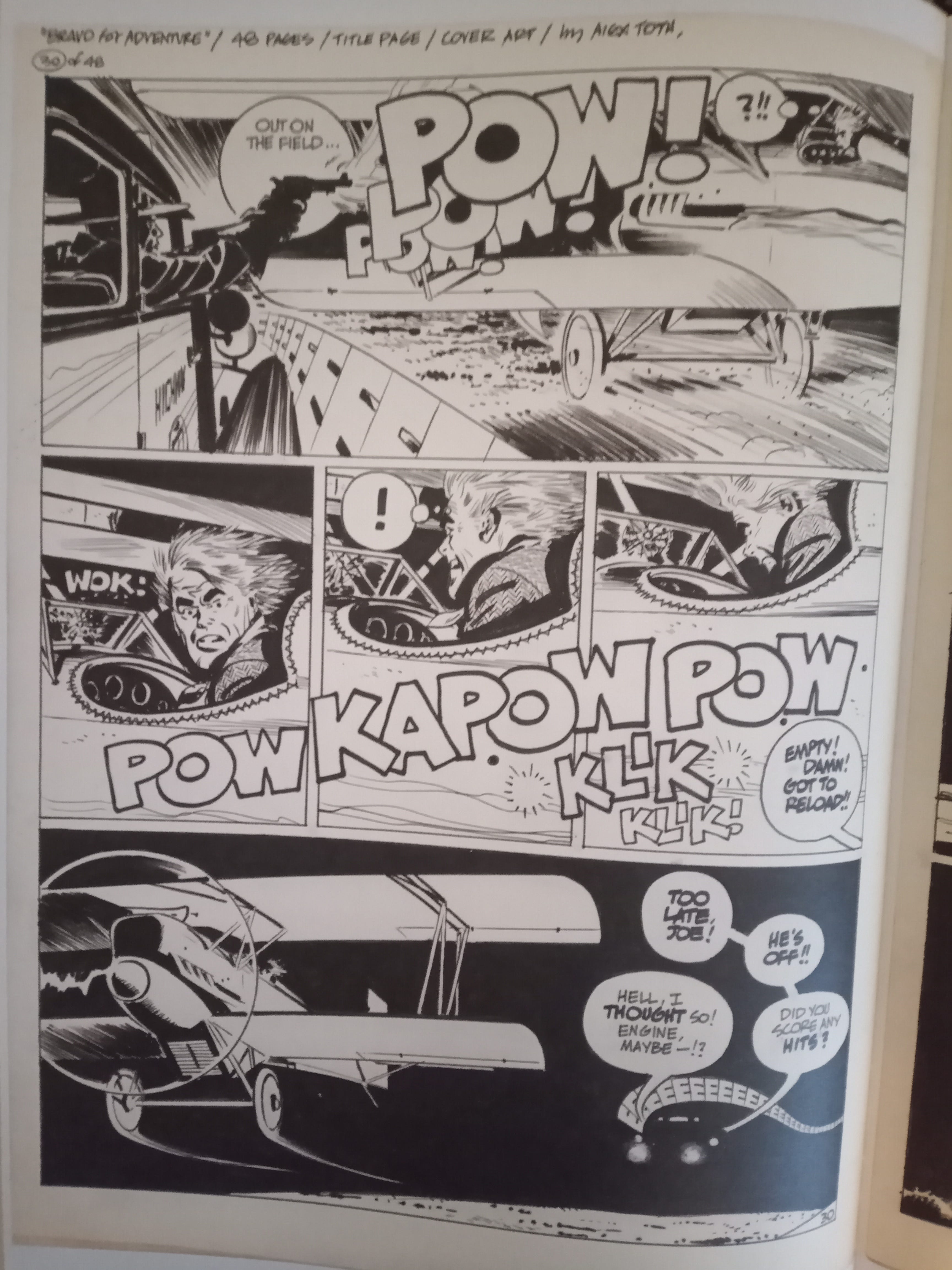
The top two tiers on this page from Toth’s tour de force, Bravo for Adventure, use onomatopoeia to represent movement through time and space, as well as volume. William Stout includes this (and a few other Toth pages) as examples to illustrate point 11 in Jean Giraud’s ‘18 Tips for Comic Book Artists’ here. The storytelling on this page is just remarkable. I can’t think of anyone else who use onomatopoeia as effectively as Toth. I love the subtle application of the police siren in the final panel too (and I stole this technique for my new comic).
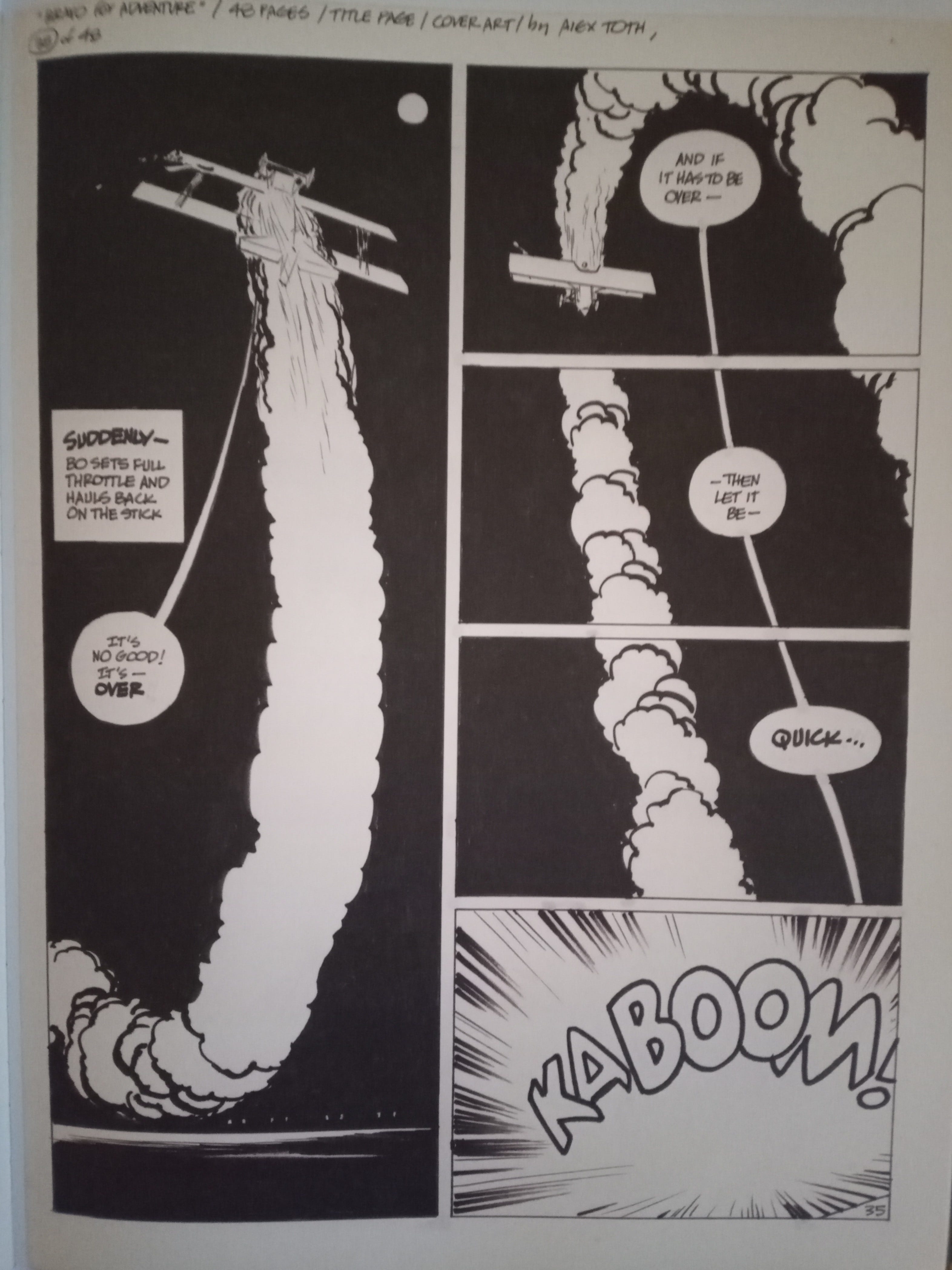
This is possibly my favourite page from Bravo for Adventure. The storytelling is just preposterously good, the chiaroscuro is gorgeous and the page design is just pure heaven. Here, Toth utilises polyptychs and word ballon placement to show the movement through time and space. Like the Kui example above (which also features a plane, funnily enough), this seems extraordinarily simple, but it’s actually incredibly sophisticated craft - which sums up Toth in a nutshell.
Groovy Cover Time
In a previous newsletter, 'What Makes a Good Cover', I banged on about, er, what makes a good cover. I’ll probably show some covers that I dig in every newsletter from now on. I mentioned George Wilson’s covers in that newsletter, so I’ll start with him. For these images, I went to the Grand Comics Database, which is an amazing resource.
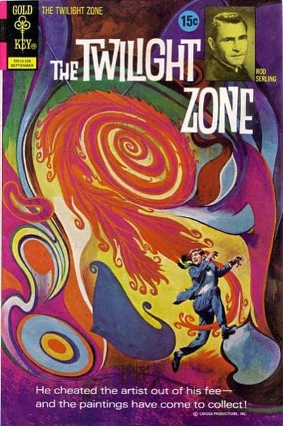
I love this cover mainly because I’m a real sucker for psychedelic imagery. Two of my favourite fine artists, for example, are René Magritte and Max Ernst, so I’m predisposed to digging surrealism or Dadaism. There’s something about that Gold Key corner box and the replication of the titles that I dig, possibly because it evokes the glory days of the spinner racks. George Wilson just paints the hell out of this cover. It’s a great composition and it pops. The photo inset just adds to the surrealism of it.
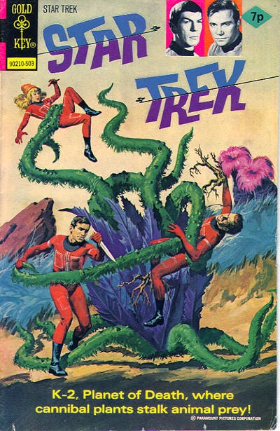
Another George Wilson cover for Gold Key and this just straight up looks like a pulp paperback. Again, there are the trippy titles and photo inset(s). I like how stiff this is, it somehow adds to the drama rather than taking away from it. The only thing I would change would be to have a garish red background to emphasise that this takes place on an alien planet and to make the cover pop more. I would thus change the spacesuits to a saturated yellow. I’m splitting hairs though, as I love this.
In Other News
I’m continuing to beaver away on The United: Five Triangles. I’m finishing up the first act of the comic, which is coming in around 75 pages long so far. I think the comic will ultimately be around the 200 to 250 page mark. That realistically means a release date of 2027. Because of that I may try and get out a couple of two or three page strips this year and next too.
Something else occurs to me is that I have not been asked to do a commission in ages. If you would like a commission of a character then feel free to email me, message me here or contact me via social media. I do A5 sketches for £10 plus postage or A4 commissions for £40 plus postage.
Also, if you’ve not read my comics and would like to do so, then please check out my online store here.
Last, it would be nice to grow the reach of this newsletter as social media is dying on its arse. If you like this newsletter then please do recommend it or restack it. I don’t know what ‘restacking’ means - I assume it means sharing the post.
NEXT WEEK I will recount the story of meeting Alan Davis last year.
Toth was brilliant, and those three Genius books are essential reading! His animation character designs alone are a treasure trove -- far superior to the shows themselves.
Aye, those are wonderful volumes and some of the unproduced shows just looked so ridiculously stunning. The concept art for Herculoids had my jaw on the floor. I really hope One for the Road is reprinted - his Drag Cartoons are typically great.